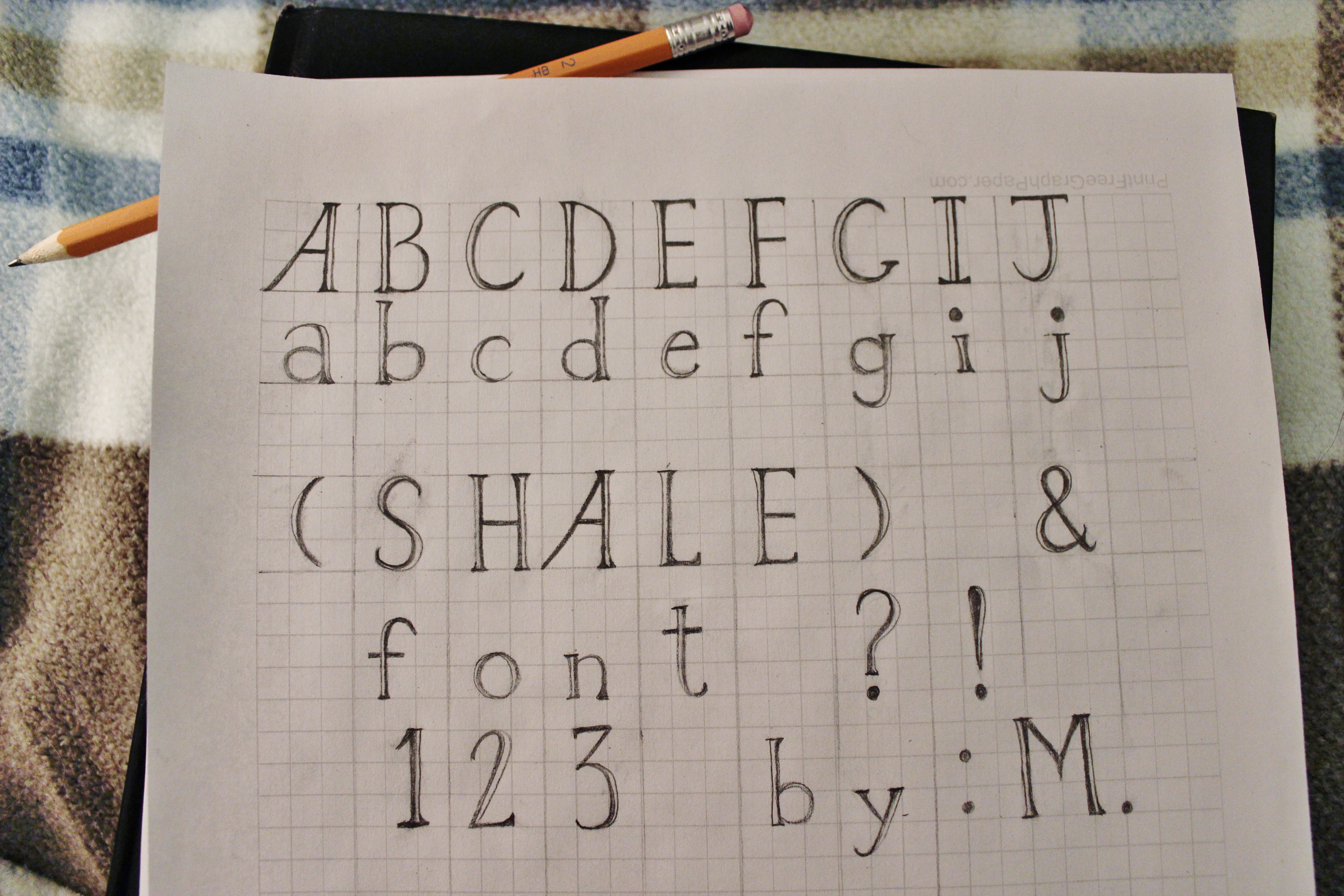
Geology has been on my mind, so I doodled a font inspired by my favorite high-fissility sedimentary rock, shale. It’s rough and cracked (like most rocks!) but attempts to be smooth and layered (like shale, specifically?), yet is ready to split apart from certain angles.
Like several others, I battled unsuccessfully with FontStruct before deciding I needed full control. Drawn in graphite on printed-out graph paper, “Shale” is smudged at this stage, with inconsistent serifs that render it still useless. (I’m no calligrapher, and making all the serifs match is surprisingly difficult by hand! Tracing paper would have improved this project immensely). Once the viewer envisions the ascenders and descenders match in height, the spacing is fixed, etc. and so forth, I imagine a final draft of this font might be used in posters requiring an embossed look with multi-layered letters. It is high-contrast enough to be used for minor announcements, but much too embellished for everyday use.

One Response to “Shale”