Let me start by saying I never anticipated how much I would hate the nitty-gritty of font-struction. I notice typography, take pleasure in it, care about it, think carefully about how I use it—but give me a ready-made font any day. (Preferably Didot 10pt, with its thrilling, baseline-dipping numbers.)
So. A tale about my font-failure. I wanted to make a font based on some handwriting samples from a collection of notes exchanged between my best friend and I when we were twelve. Handwriting instruction has been much on my mind lately—even before this week’s reading. I keep thinking back to the D’Nealian cursive workbooks we had in 2nd or 3rd grade. In my memory, we received the workbooks on the first day of school, but didn’t begin learning cursive until later in the year, so that I spent some period of time looking at the mysterious letters and waiting impatiently to begin practicing. Their scarves and tails sculpted so perfectly to meet each other and make words! I was, clearly, a certain kind of child.
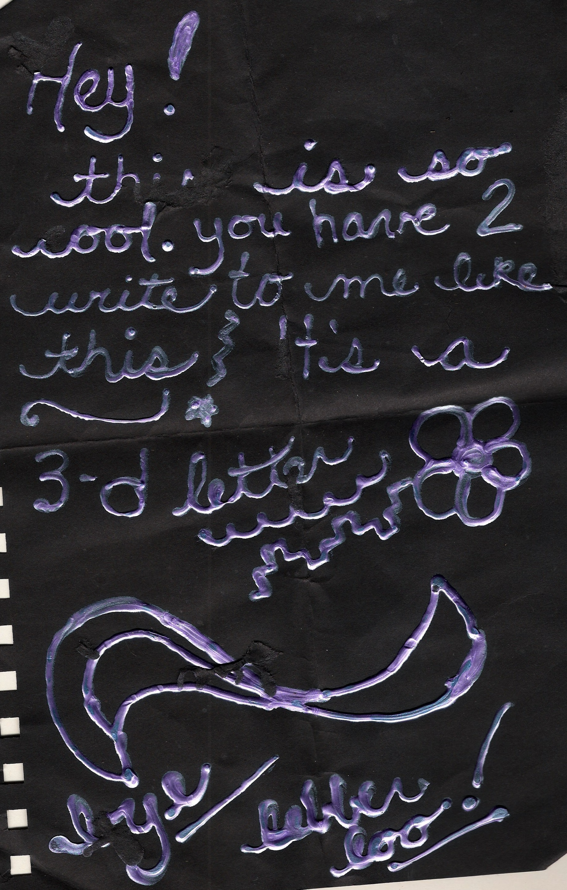
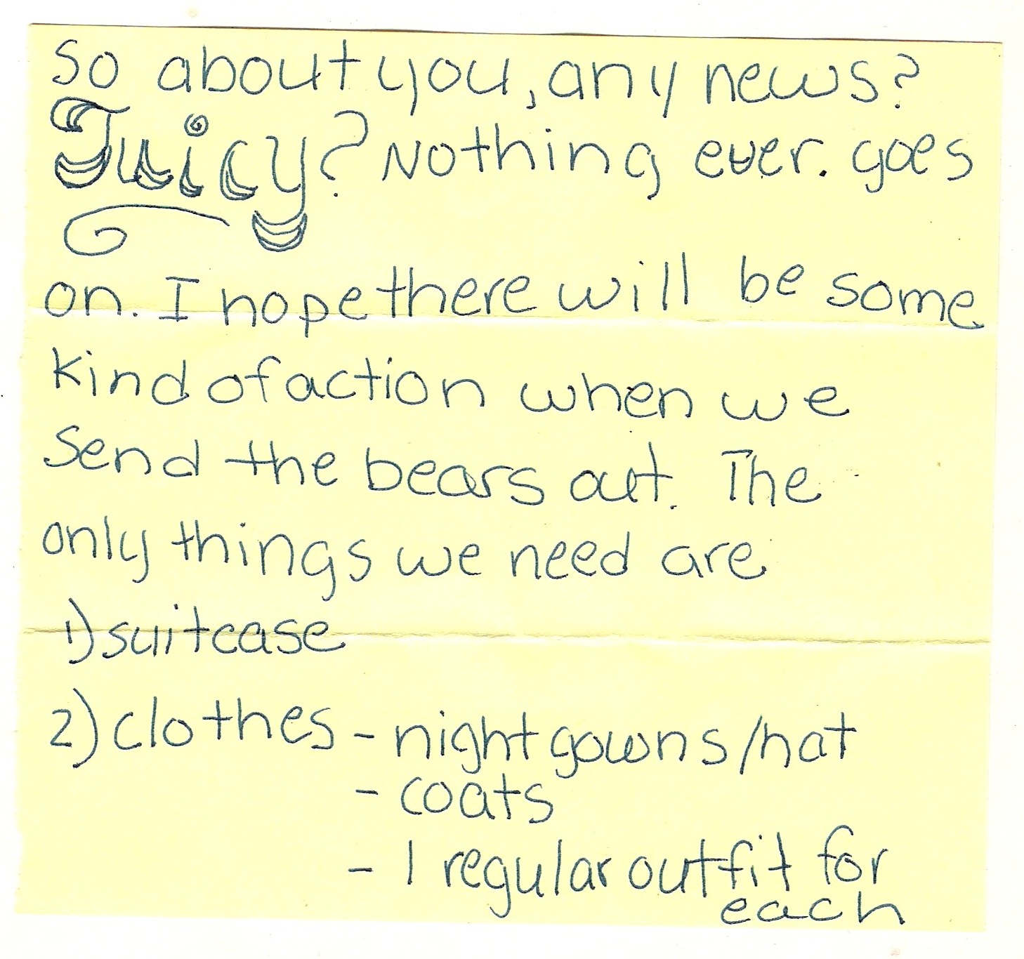
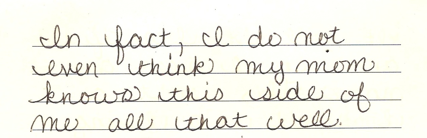
My class was probably one of the last in our school to use the D’Nealian books, to learn cursive at all, and once we learned cursive, it wasn’t enforced, so that my handwriting eventually broke down into the print-cursive hybrid it is today. I don’t know if any of you had similar experiences, but by middle school, I was spending a lot of time trying to figure out what I wanted my handwriting to look like, and my best friend was too, and the notes we exchanged were the stage for those experiments (as well as lots of other more troubling experiments in expression and identity-shaping). The notes below sample this transformation. Most of them are written in my friend’s hand; I always admired her round, playful letters, and the curls of her cursive. My writing was more narrow and proper, rule-bound—which, come to think of it, is pretty much how my classmates thought of me, so maybe that’s why I didn’t care for my hand.
I wanted to make a font that worked with this hybridity. I looked at the handwriting template first, but I felt like it was too constricting, like it would be impossible to fit my friend’s letters in there. So I went over to FontStruct—and learned very quickly that the geometrical piecing together of letters on a grid is not for curve-stubborn perfectionists like me. I mean, really: Not. For. Me.
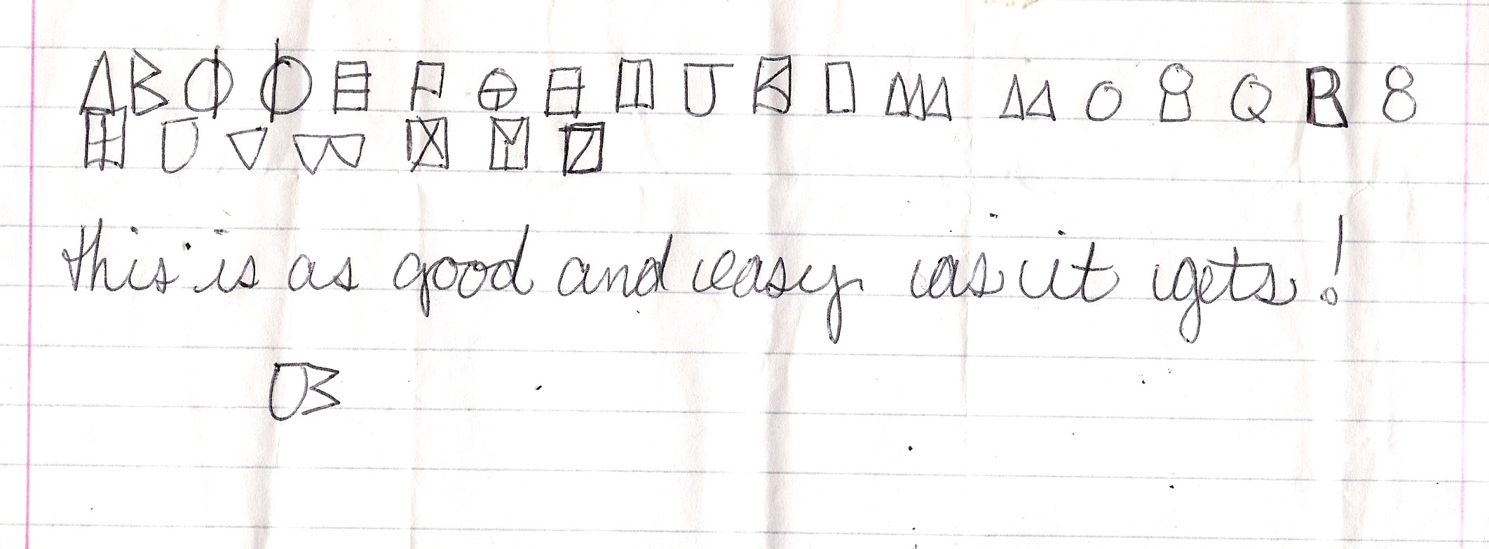
But I (somewhat) persevered. I settled on making a digital version of the code in the above note (we were always coming up with new codes that made writing things like “Sit by me at lunch?” more work than they were worth). I’ve only gotten to the letter M, and I feel like many hours and days later I am only just now acquiring the grid-puzzle-friendly vision to actually do this well. If I ever finish this font to satisfaction, I would call it Maritime, for the boating flags that it reminds me of, which people sometimes string along their porches in the Thousand Islands.

I don’t know if kids write in codes to their best friends anymore: how many middle-schoolers have cell phones now, and don’t those offer a kind of privacy that makes code unnecessary? But maybe my font would do well on some sort of maritime poster. My cousin’s having a nautical-themed wedding in May—maybe I’ll try to pitch it to her.

4 Responses to A Font Tale.