This all started after my rapid frustration with FontStruct. I got to “d” on that clunky, contrived grid and slammed my laptop shut. How could I create pixels, or basic design units for letter-shapes, in a way that would be manageable for me?
This led me to the kitchen. I thought back to preschool activities when we were encouraged to make designs and words out of foodstuffs, especially pasta.
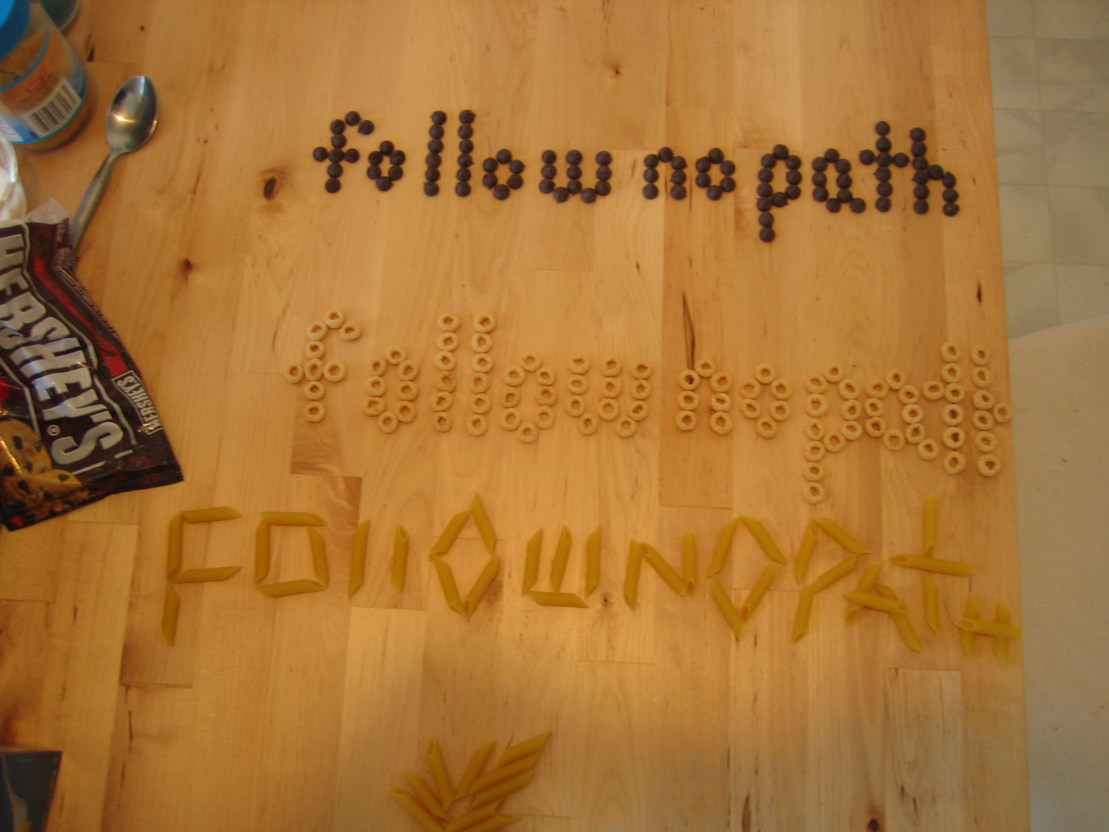
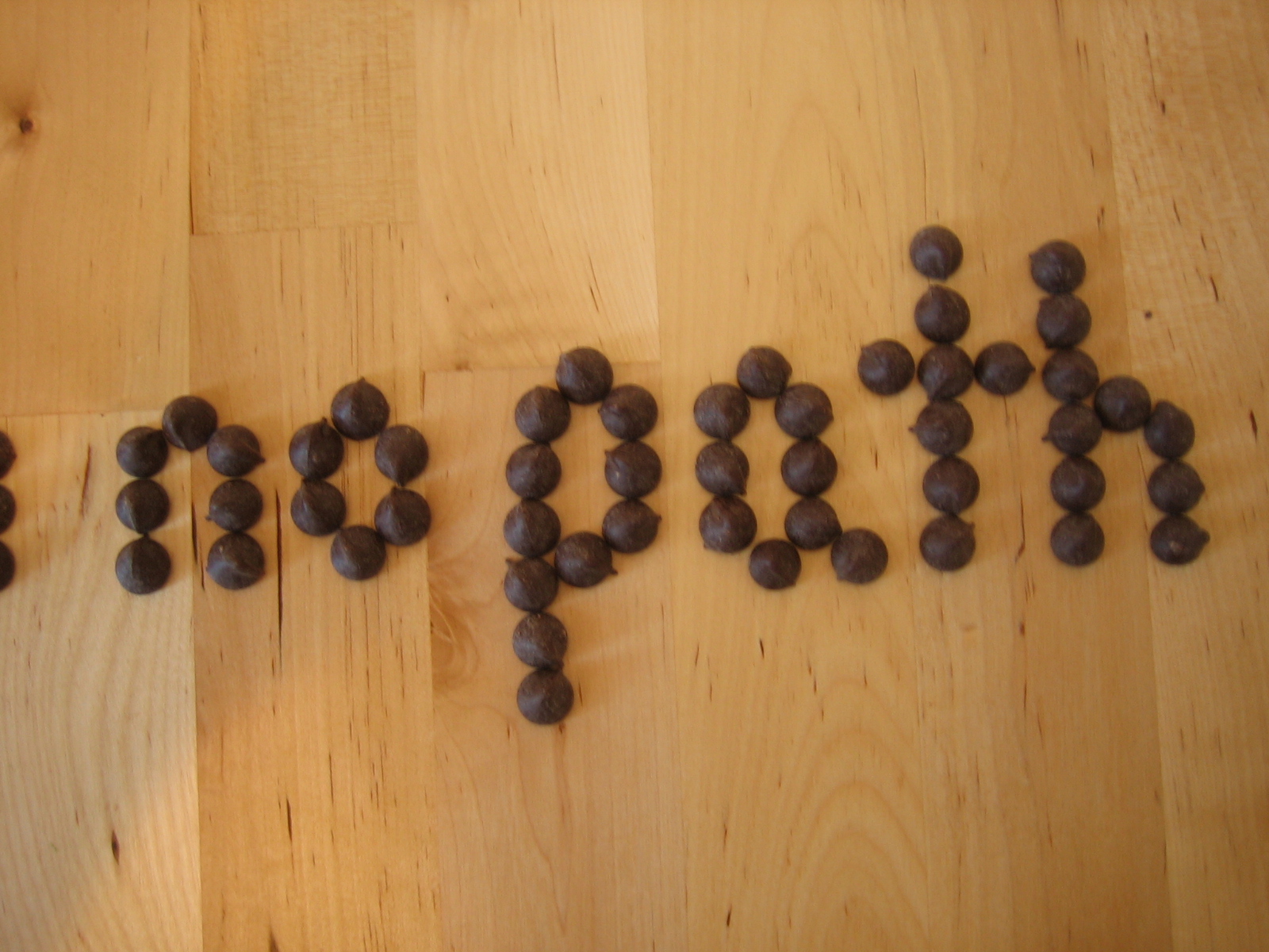
It was easy to make measurable units with chocolate chips and honey nut O’s. I was able to make these letters relate to each other structurally by consistently using the same number of chips and o’s for their height.
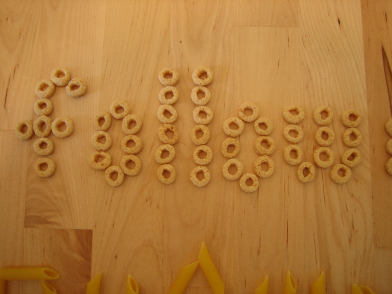
(You’ll notice that I misstepped on the o’s “f.” It should have been 6 o’s tall. Didn’t catch this ’til after.)
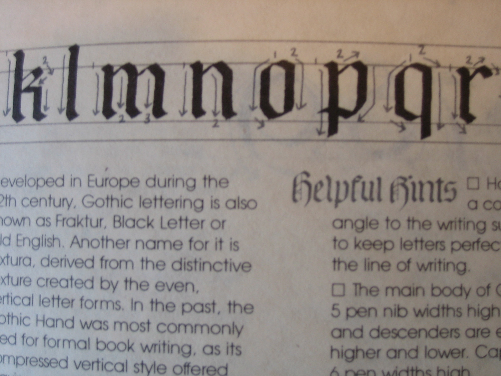
Before starting with any of these materials, I gave some thought more abstractly to how the typeface would be constructed. I found myself struggling to reinvent the alphabet, so to speak. I noticed that the proportions and patterns of the chocolate chip- and honey nut O- fonts that I made rip pretty shamelessly from the Gothic Hand that I learned from a Sheaffer calligraphy book. Look especially at the lowercase.

With a little practice, you realize that the Gothic letters, although they look complicated, respond to just a few basic shapes that repeat over and over. You can really see the basic diamond shape here in the lowercase “o,” “m,” and “n.” The proportions of the letters respond directly to the width of the nib on the pen you’re using. In the Gothic Hand, the basic lowercase letter height is 6 nib-widths high. In Chancery Italic, it’s five. I didn’t go the distance to measure out the chocolate chips, but I could have.
The penne pasta forced me away from these patterns. Obviously, they don’t work as well as pixels because they’re disproportionately long, covering the space of many units. The result, though, was interesting: more jagged, aggressive, rough-hewn letters. They don’t all look like part of the same family.
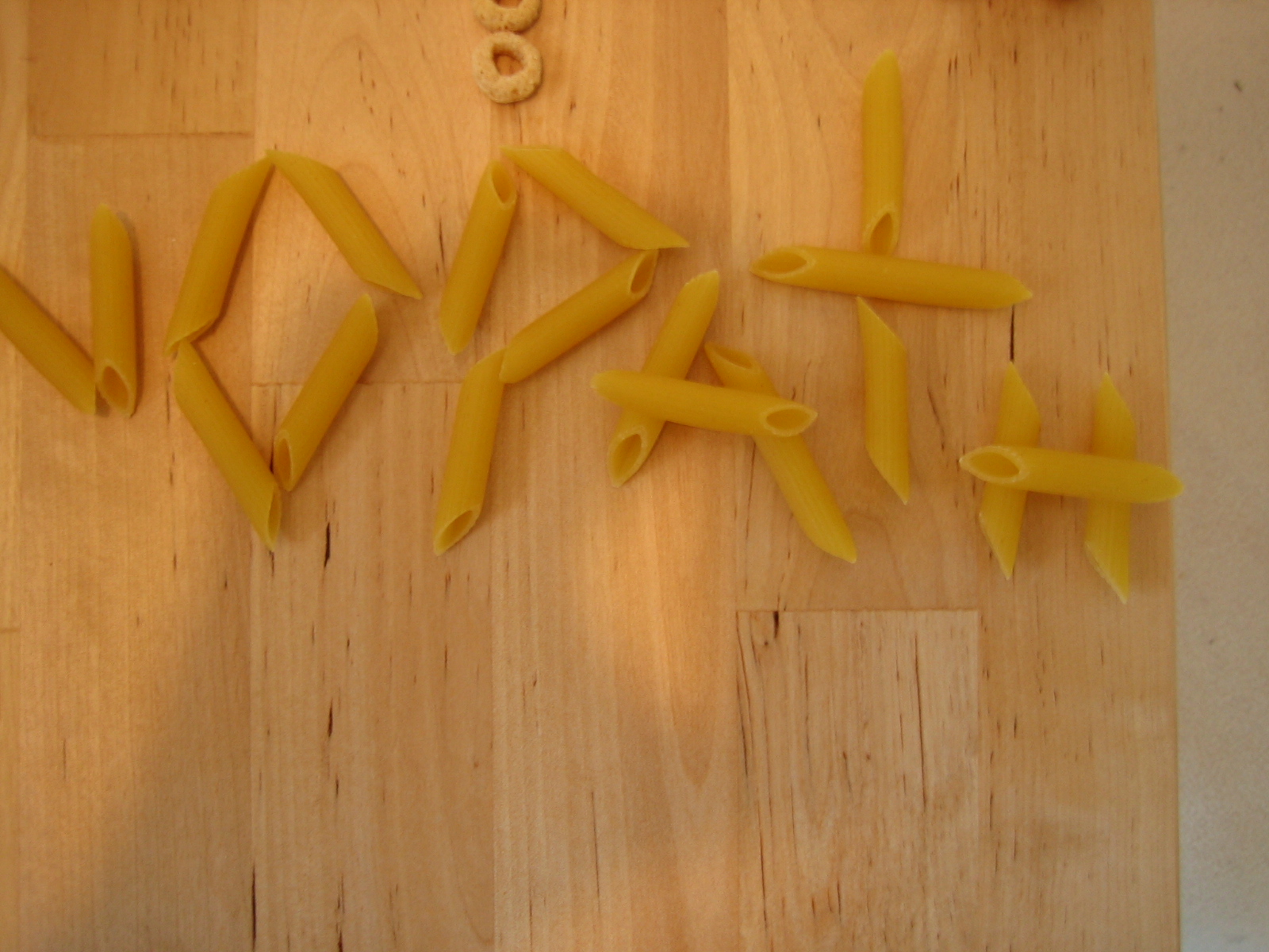
I also had a jar of capers in the refrigerator, but I figured my point had been made already, and that at any rate they would function pixally like the chips and o’s.
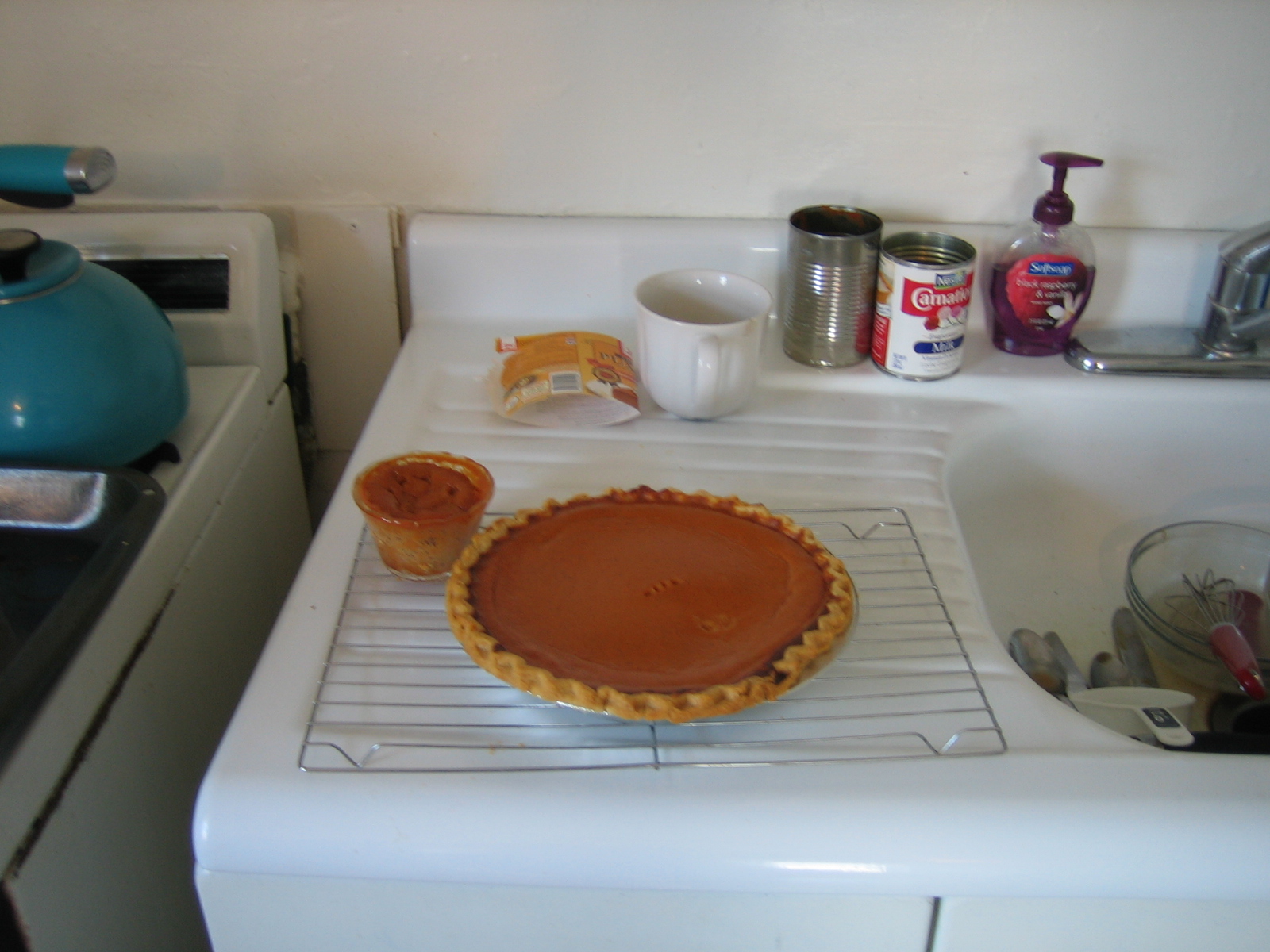
Unfortunately I did not make enough pumpkin pies to test them as a typeface.

2 Responses to Would a pixel by any other name…?