So I spent an unproductive amount of time on Fontstruct and was completely pissed off because, while it’s user-friendly to some extent, I was totally unprepared and overwhelmed by the whole thing. To think that Eric Gill probably spent years or, at least, months on Gill Sans is making me feel like what I’m attempting to do is sacrilege or blasphemy.
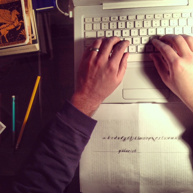
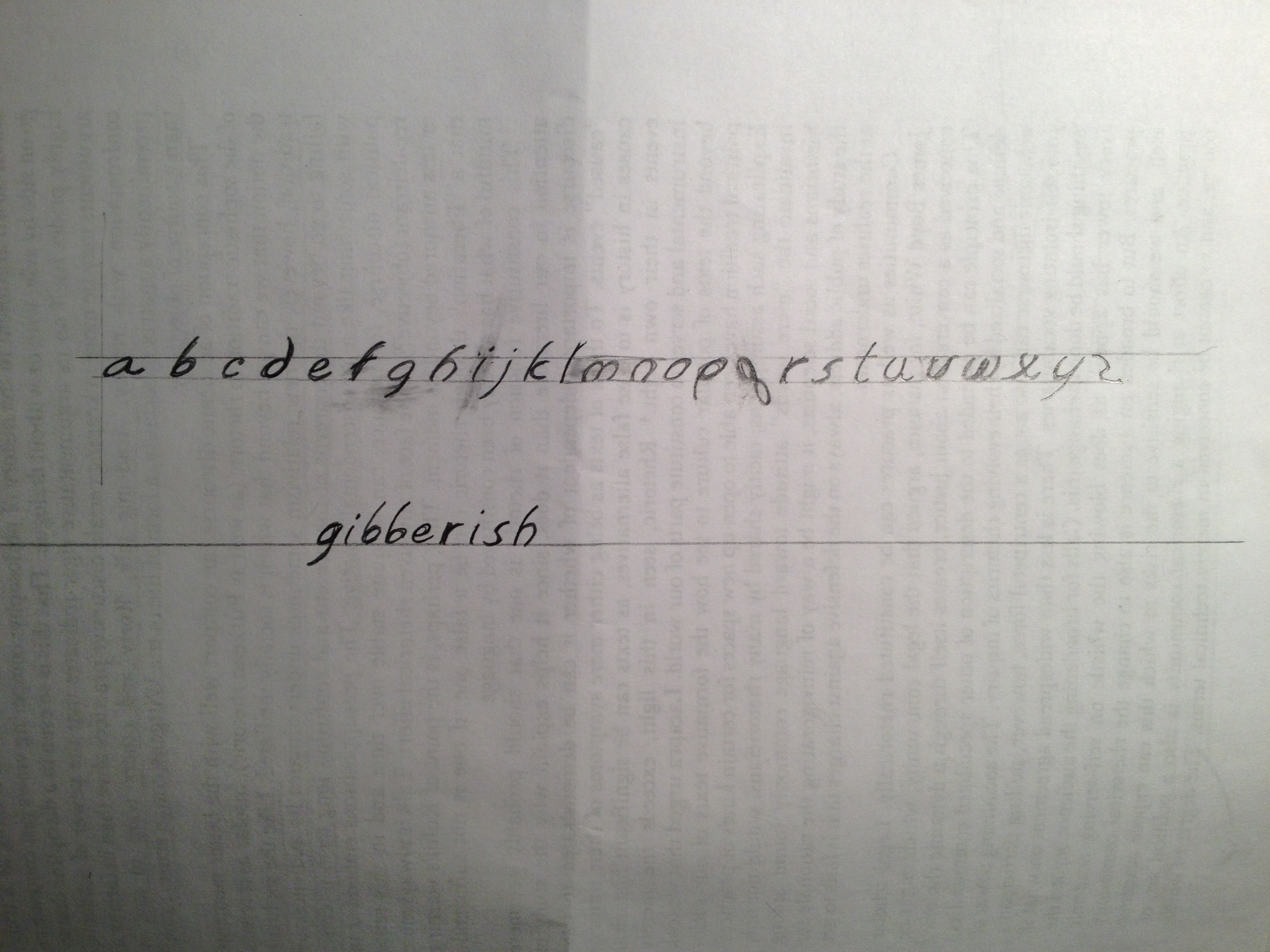
In any case, I was three letters in when I realized that I am a competent draughtsman. So I got the pencil out and started freehanding. What I ended up with isn’t gold. It’s not even anthracite. But it’s probably somewhat unique and reminds me somewhat of comic book script. It’s a sans serif font, mostly. (it cheats here and there.) And it’s totally based off the lowercase “a” which I lettered first. All the letterforms are based off the lowercase “a” bowl.
Hardest letter to figure out: “q”
Most incongruent letter within whole alphabet: “x”
Reason why I named my font Gibberish: because it is.
Fonts are a weird thing because I highly respect them, but they are totally alien to me. I always thought that one day I’d be good enough to do two things:
- be a tailor of bespoke suits, and
- design my own high class font
Neither of those ever, or will, come true. Designing fonts is an incredibly difficult task. And I respect all the designers from Gill to Garamond. It makes sense why they are so expensive to buy in a whole set. Because they spent an insane amount of time making them beautiful.
Take a knee, people. Thank a font. (Click on picture for detailed view.)