okay, this is the first try of my flame font. I saw the flame shapes on fontstructure and they just spoke to me. So then I wrote this like it’s some newsletter from hell. I only made capital letters, I think this font would be only used for decorative purposes, so it wouldn’t be used to write out whole paragraphs. I screenshot this directly from the webpage’s preview screen and did two letters in each shot, hence the unevenness of some of the words sorry about that.
I could see this font being used on posters for a hell-themed party (or a New Jersey Devils fan gathering). Or I can see it being used by a snowboarding brand, either on a snowboard itself or a t-shirt or sweater.
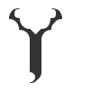
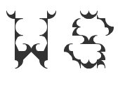
I am really really pleased with the “Y”. the “W” actually gave me the most trouble. I tweaked the “W”, “D”, and “S” after this first go.
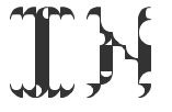
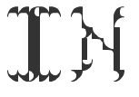
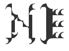
 I worked on tweaking the “N” to using the thicker straight lines, but felt it just looked better with the thinner lines. I think Lupton would hate that I didn’t keep line widths consistent, so here is a comparison