Set Up
Originally, I wanted to craft a font comprised of my big, dumb face making vowel and consonant faces. My thought was maybe I could create a “font” that could be “read” by Wylie. I could use it to spell out words like “m-a-m-a” and “d-a-d-a” by flashing images of me making m-face a-face m-face a-face. But then I started thinking about “C” and “K.” What’s the difference between c-face and k-face? And what about “M” and “P,” which, but for some tension of the lips, look the same at the beginning of their sound. It’s the act of saying “P” that differentiates it from “M.” So I considered making a font comprised of gifs of my big, dumb face making vowel and consonant faces. But then I realized this was a rabbit hole. A hugely time-consuming rabbit hole that would have me spend more time making gifs of my big, dumb face making vowel and consonant sounds for my son, than I would be spending time making big, dumb vowel and consonant sounds for my son in person.
So, I did the “Modular Letterforms” activity on page 78.
The Font’s Not the Interest, the Making of It Is
One of my first aesthetic decisions was that I wanted letters that were about twice as high as they were wide. I can’t necessarily fully account for this aesthetic decision, but I think it comes from my own handwriting, which tends to be pretty tall (I think), but not so tall that it looks like it’s going to fall over. It’s tall, but it’s got a good base to it. Might this aesthetic decision somehow be wrapped up in my own body image?
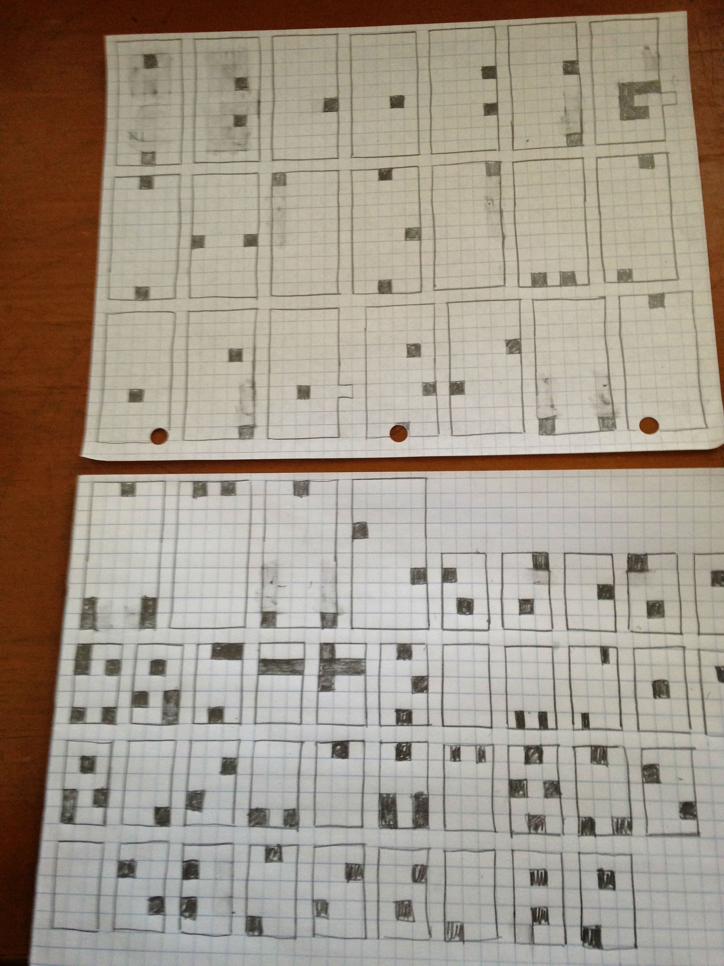
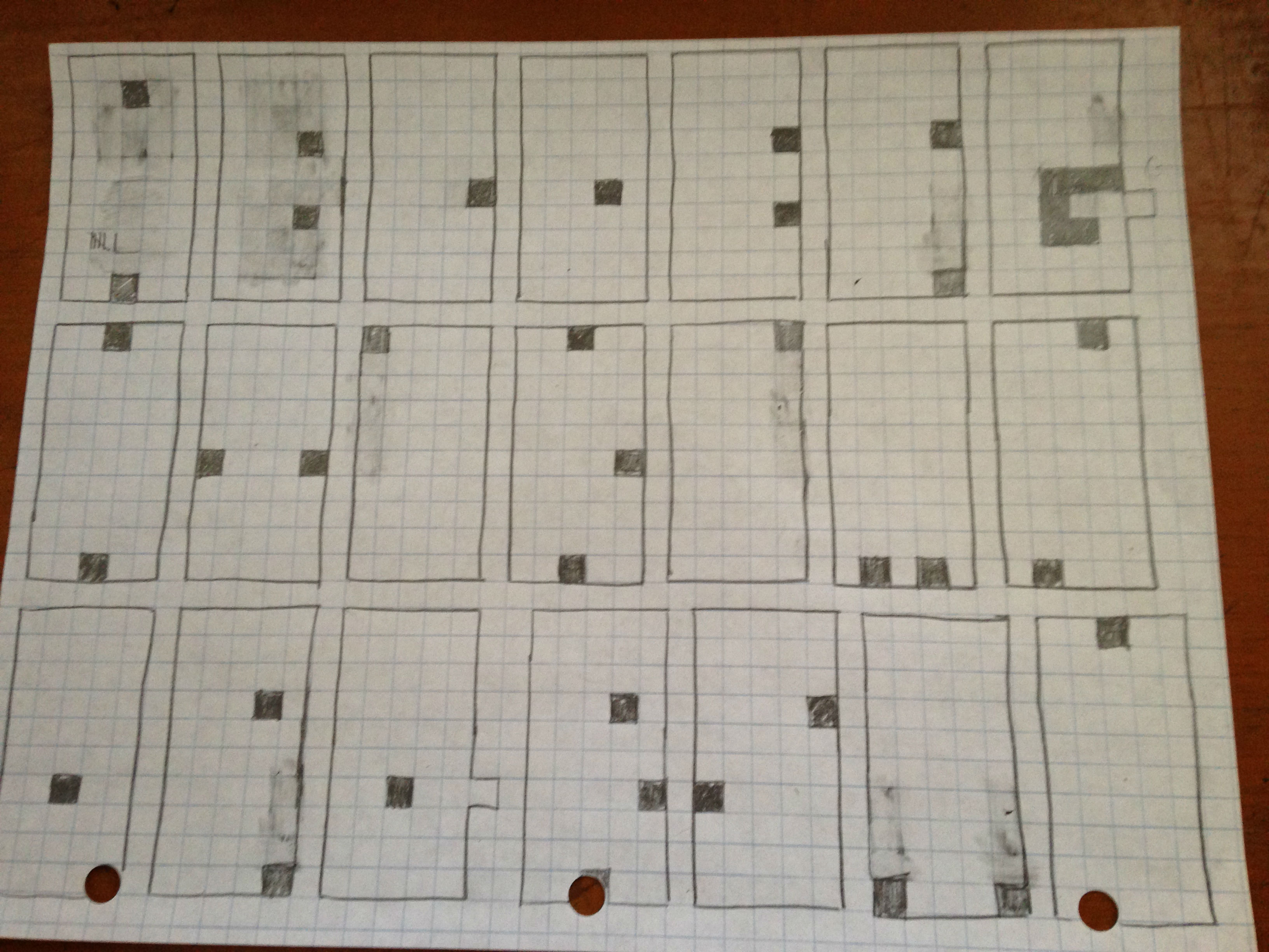
Working with graph paper, I reasoned that three wide, six high might be too small for some letters. M and N, for example. I figured they’d need more space for the little spatial incursions. (This is foresight that I lacked when I transitioned to my lowercase letters, incidentally. More on that later.) So, I settled on five squares wide, ten squares high for each letter.
Next, I wanted the incursions, the spaces that cut into the 5×10 block to be minimal. I hadn’t yet thought about how big the islands of space in the letters ought to be, so I used a bunch of blocks at first. I kept the incursions small, but the islands grew big.
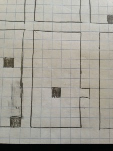
This changed around the letter D. How, I thought, could one properly differentiate between a D and an O if the island of space inside the block was equally large. There ought to be some way of positioning the island of space inside the D block to the right, while centering the island of space inside the O block. But I was only working with islands that had the possibility of being three squares wide. So what? Make them two squares wide? Then you couldn’t center the island inside the O block, and one of the reasons I chose a 5-square wide base was for the centering possibilities. So, I figured that like the incursions of space into the block, I would also make the islands as minimal as possible. One square islands of space. This allowed me to position the islands to the right in a letter like D, while keeping them centered for letters like O and Q. This also meant that I had to do some erasing inside my A block.
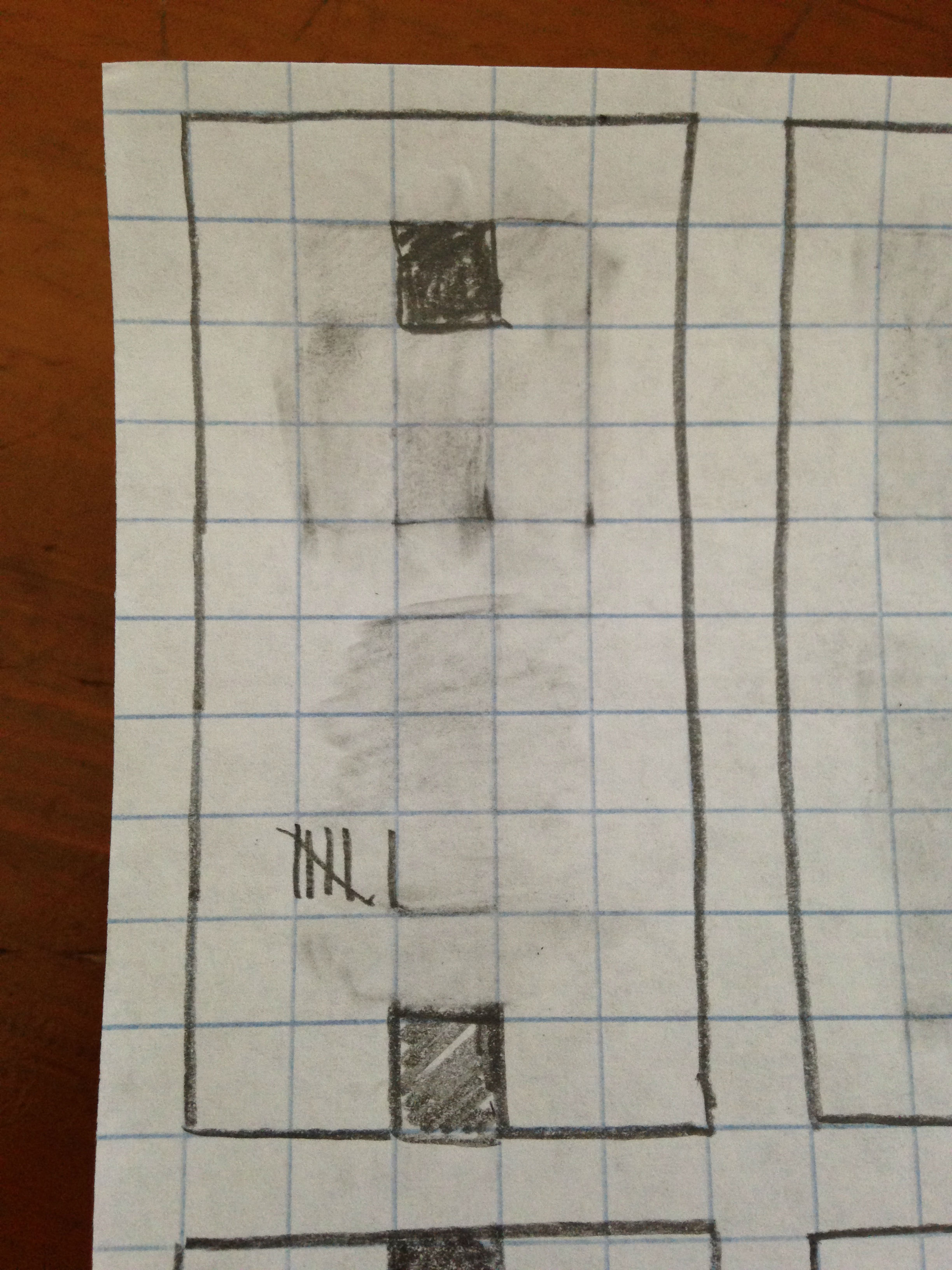 In fact, I did a lot of erasing inside my A block. Here’s a close up with a tally I kept of the number of times I made changes to this first letter. It wasn’t until about the letter H that I stopped going back to A to “fix it.” So, basically, for the first eight letters I tried to create for this font, I had to make amendments to my first letter six times, or 75%. This got to be a joke after awhile, but it made me realize that font creation is much like sestina writing. You’re working within constraints (incompletely designed though they were for me), and your operational decisions in those constraints represent an aesthetic-in-development. I had an aesthetic notion (a very rough aesthetic notion) of how I wanted my letters to look. But I had to, at least with the A and sometimes with the B, go back and amend that look as new constraints and problems and possibilities presented themselves.
Fuck You, GQ
When I hit my stride, the letters started writing themselves, particularly when I got to letters that mirrored other letters, as with M and W, S and Z, or J and L. Because of how I was creating these clunky letters, I knew that as soon as I got M, I had W, and as soon as I had S, I had Z. So for most of the letters in the alphabet, I cruised right along.
Except for G. I stared at the 5×10 block with much consternation before finally deciding to move on and come back to it. And Q was an even bigger nightmare. I actually had to get up from the desk, walk around the room, pet my cat, check my Facebook, and then sit back down again to figure out how the hell to make that little goddamn tail on my Q.
To introduce some sort of cancerous outcropping, some sort of hideous growth that protruded like a hernia, that stuck out like, well, a thumb, it offended my aesthetic sensibilities. And keep in mind, this was for letters that lived within a 5 square by 10 square rectangle, so I wasn’t exactly operating with profoundly developed aesthetic sensibilities. Finally, I bit the bullet, and gave my Q its monstrous growth, a little wart that still grins at me like the smarmy prick that cuts in front of you at the grocery store.
And like all cancers, this aesthetic abomination metastasized, growing back and infecting my G.
I now had free reign to do whatever the hell I wanted with my G, so I added growths, and slashed into the block with reckless abandon. The result is the stepchild of my font. My compromise, burden, my responsibility, my G. Oh, sure, it looks like a G. But it also looks like it belongs to another font, a font with lesser aspirations. 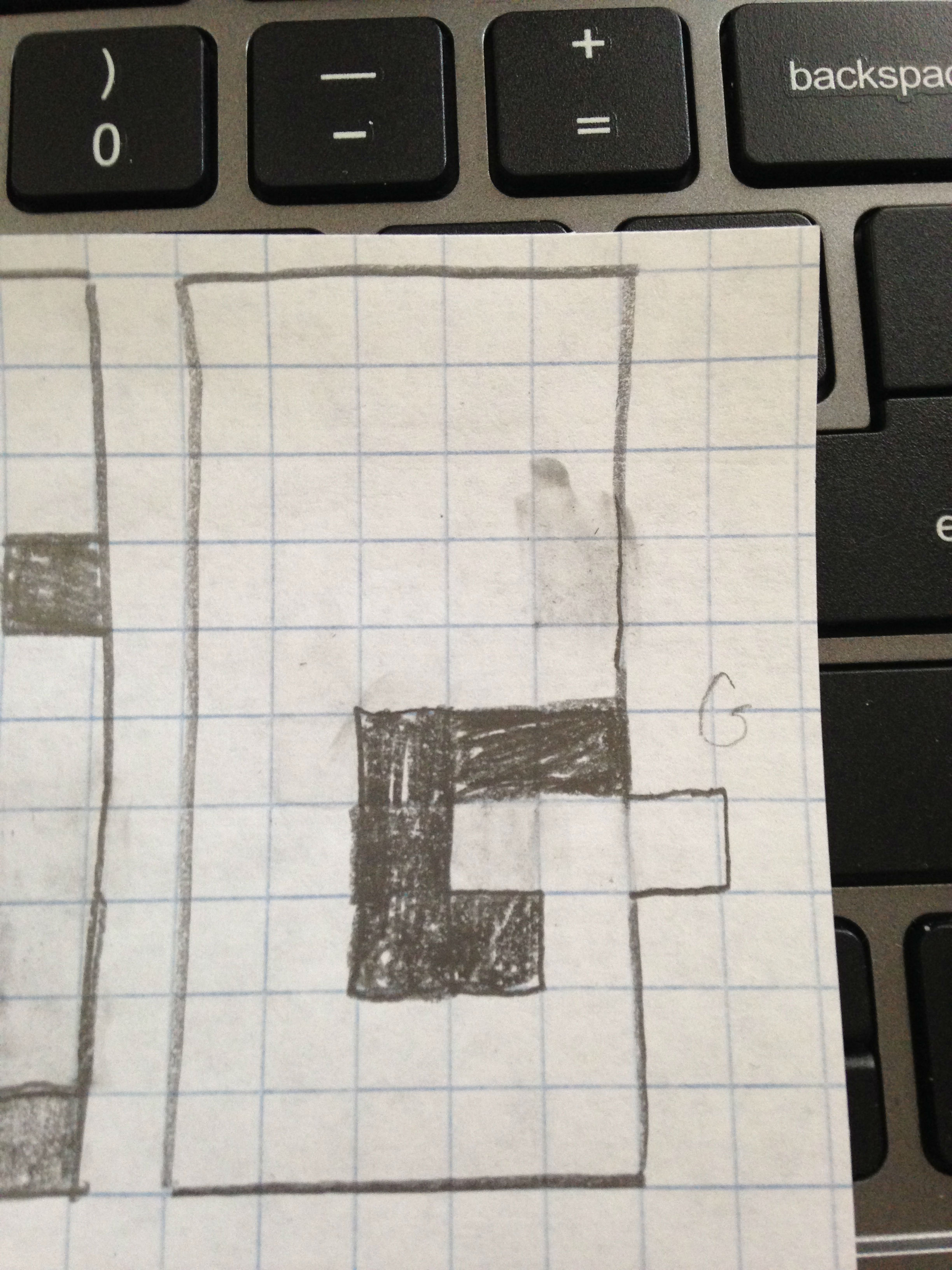
Lower the Boom
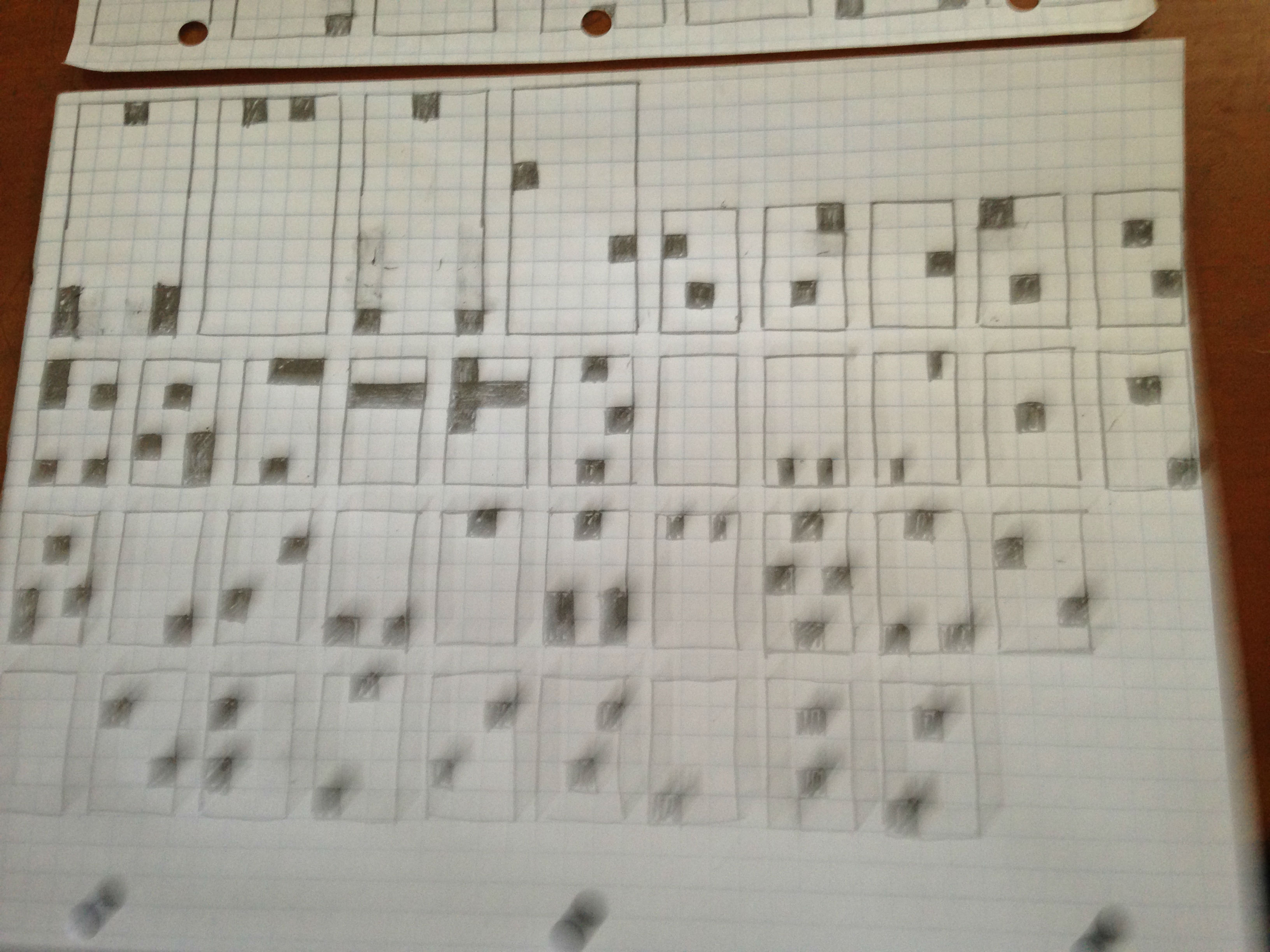
In my haste to forget my G and Q, I forgot make a capital X. No problem, as I reasoned that my capital X would be a rough approximation of my lowercase X. For my lowercase letters, I dropped the dimensions down to three squares wide, five squares tall. I wanted them to be half as tall as the uppercase letters, as well as slightly larger than half. If one were to write a word that started with an uppercase letter, it would be weird to be able to fit two lowercase letters inside one uppercase letter. But I liked the design possibilities of being able to stack letters next to an uppercase letter and have them be exactly as tall.
The lowercase letters flowed easily now that I had the hang of it. I’m in love with my i, and my l is pure simplicity, just a 3×5 block. I was doing great until I got to my m. I knew immediately that I had made a terrible mistake, a mistake which as I mentioned before, I had anticipated when crafting my uppercase letters, but not one that I considered before making my lowercase letters. Since my G and Q had already put me in the compromising mood, I decided to make the incursions 1/2 squares wide, and 1 square tall. “All in all, it was still a one square incursion,” I reasoned, “it’s not like I’m adding a goddamn tail.”
In a bizarre twist of fate, my held over frustration from G and Q were totally dissipated when I realized that, for as long as I remember, g and q have always been mirrors of each other in my mind. This must be a holdover from printing or cursive writing, in which the moves for making a lowercase g are inverted at the bottom of the descender. Initially, I tried to keep my g too simple, though, and my q ended up being identical to my e. So, I added a bit more space. Now, even though there is quite a bit taken away from their respective 3×5 blocks, I’m rather fond of my g and q.
Numbers
I should probably make my numbers a different height than my lowercase letters because in their current form, my 1 is the same as my l, my 2 is the same as my z, my 5 is the same as my s, and my 0 is the same as my o. As it is currently constructed, my font will require readers to do a little contextualizing work to differentiate between these numbers and their identically constructed letters.
And this reminds me of academics who resist calls for plain language, oddly enough. The argument goes that sometimes constructing complicated and convoluted prose is an act of resistance, in a sense, that such prose requires readers to stop and pause, to reflect on what they’ve just read. In a sense, it forces readers to be aware of reading, which Lupton suggests is the exact opposite purpose or aim of a good font. A good font is supposed to make you forget that you’re reading; it’s aim is to be a transparent technology of sorts. So what might the implications be if, when creating a font, a designer thinks to himself or herself, “I want them to get stuck up on this letter?” I’m looking at you, Medieval S/F!
