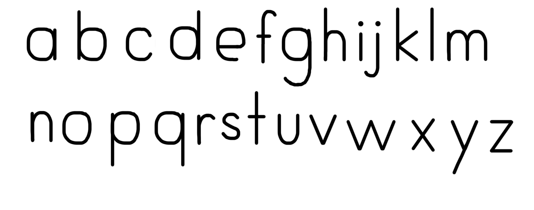
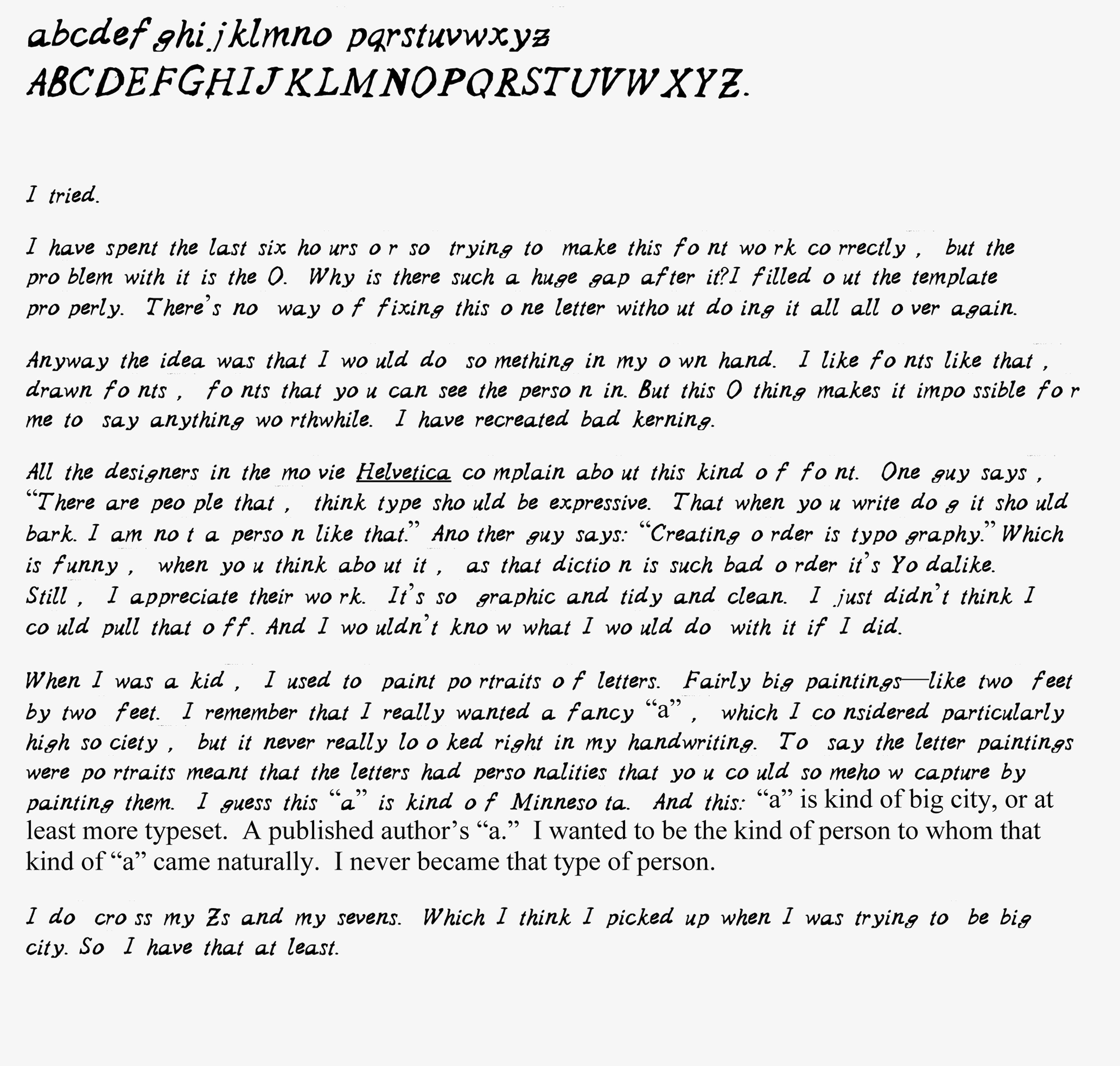
Right now I don’t think I have the capacity to string together anything remotely intelligent, so I hope the font speaks for itself.
It may look like this did not take me any time at all. But it did.
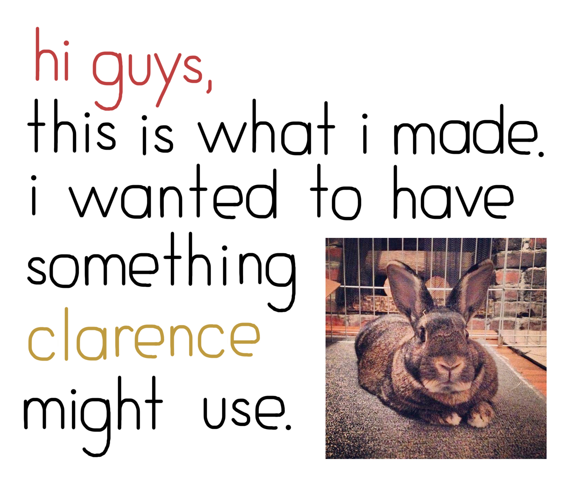
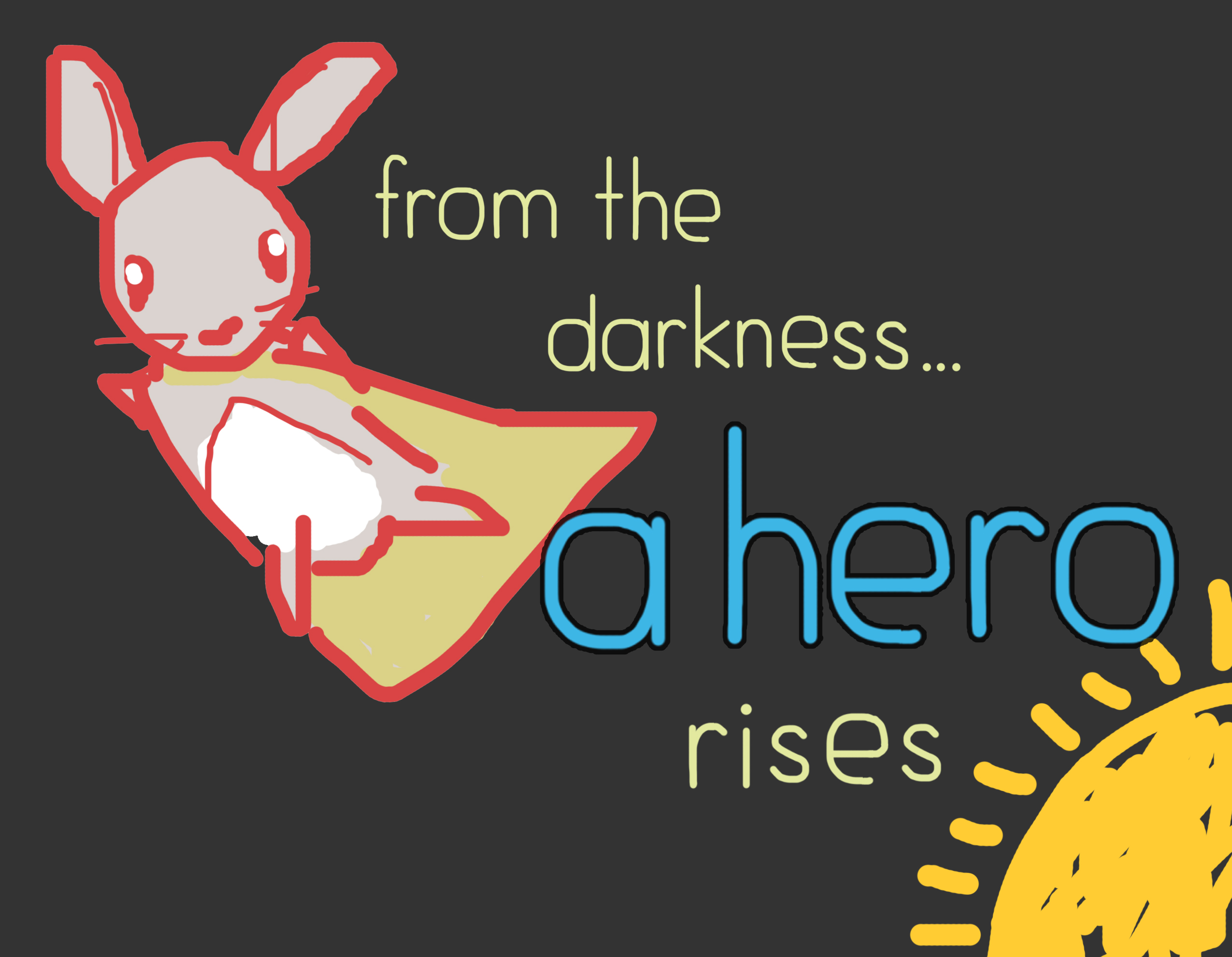
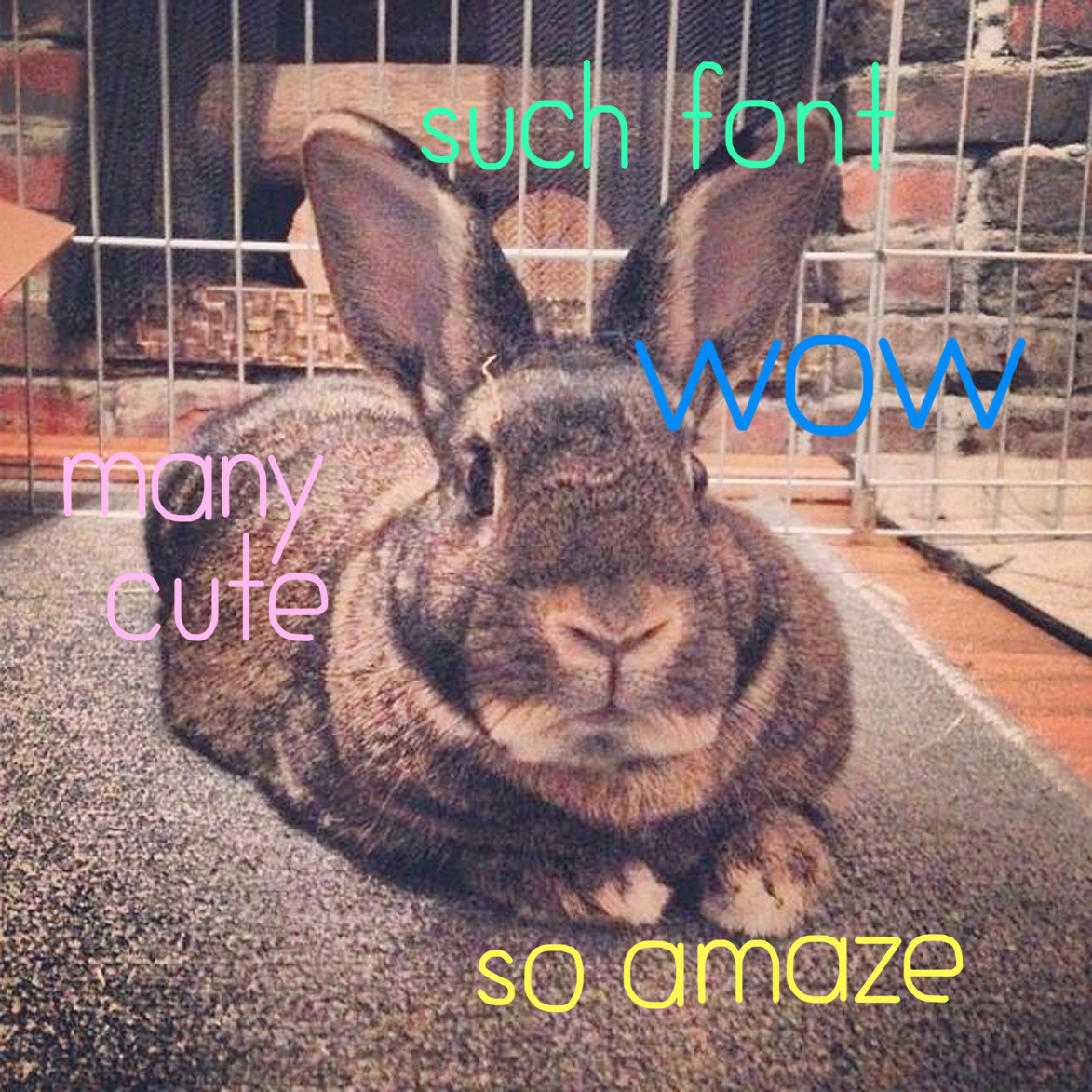
Here are some instances in which I picture the font being used.
DOGE. YA.
Also, this all represents my illicit love affair with Comic Sans.
I love you Comic Sans. When no one else cares, I will be here for you. I will be your shoulder to cry on. I will hold you tight and whisper sweet nothings in your ear. Because you will always be mine, now and forever.
THIS TOOK ALL DAY. I AM GOING CRAZZZZZZYYY. MY HEAD HURTS.
I hope my font, bitNap, shows up in the published version of this post. It’s behaving weirdly.
One of the hardest thing to do when making a font is deciding what kind of font, especially after going through Lupton’s historical whirlwind of options. So I opted for the constraint of the prompt she gives on page 58:
“Create a prototype for a bitmap font by designing letters on a grid of squares. Substitute the curves and diagonals of traditional letterforms with rectilinear elements. Avoid making detailed ‘staircases,’ which are just curves and diagonals in disguise.”
Not using curves and diagonals, especially for letters like s and z, presented the biggest challenge in making a bitmap font. No, I should amend that statement: The biggest challenge of making a font in a reasonable amount of time is perfectionism. I had to be content with my shabby font. People like Baskerville spend years designing inventive, transgressive fonts, which become old hat in a few years. bitNap may not be impressive, but it’s mine. I actually like my S quite a bit.
So I spent an unproductive amount of time on Fontstruct and was completely pissed off because, while it’s user-friendly to some extent, I was totally unprepared and overwhelmed by the whole thing. To think that Eric Gill probably spent years or, at least, months on Gill Sans is making me feel like what I’m attempting to do is sacrilege or blasphemy.
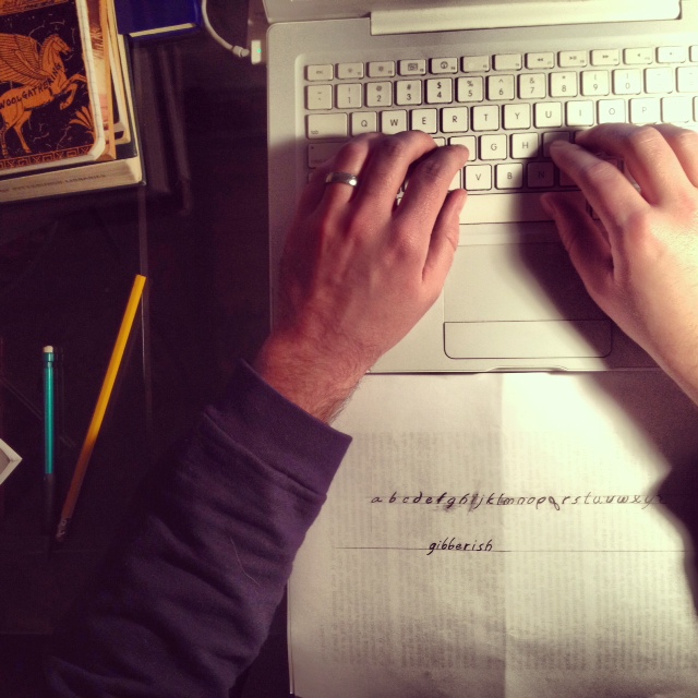
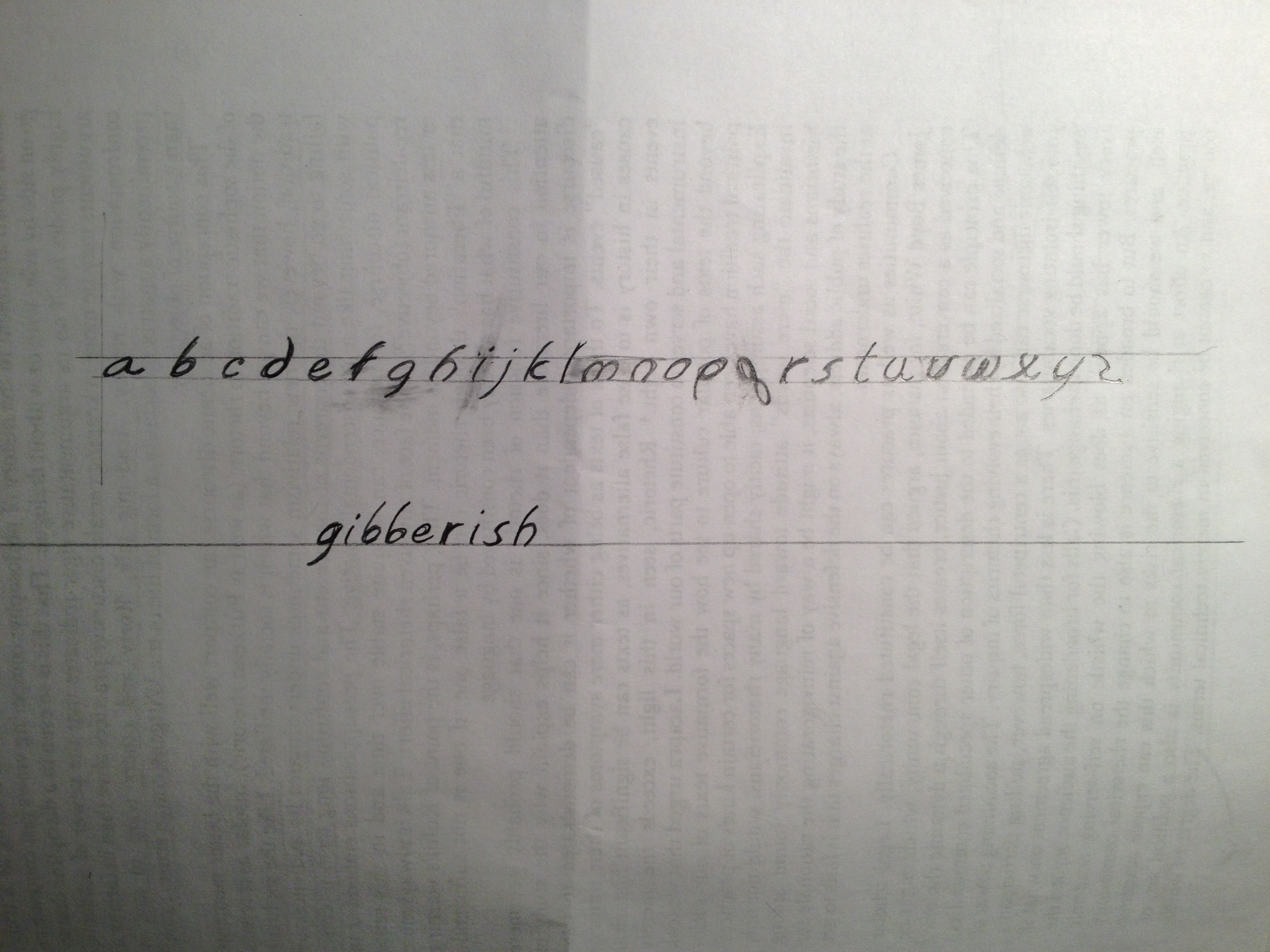
In any case, I was three letters in when I realized that I am a competent draughtsman. So I got the pencil out and started freehanding. What I ended up with isn’t gold. It’s not even anthracite. But it’s probably somewhat unique and reminds me somewhat of comic book script. It’s a sans serif font, mostly. (it cheats here and there.) And it’s totally based off the lowercase “a” which I lettered first. All the letterforms are based off the lowercase “a” bowl.
Hardest letter to figure out: “q”
Most incongruent letter within whole alphabet: “x”
Reason why I named my font Gibberish: because it is.
Fonts are a weird thing because I highly respect them, but they are totally alien to me. I always thought that one day I’d be good enough to do two things:
be a tailor of bespoke suits, and
design my own high class font
Neither of those ever, or will, come true. Designing fonts is an incredibly difficult task. And I respect all the designers from Gill to Garamond. It makes sense why they are so expensive to buy in a whole set. Because they spent an insane amount of time making them beautiful.
Take a knee, people. Thank a font. (Click on picture for detailed view.)
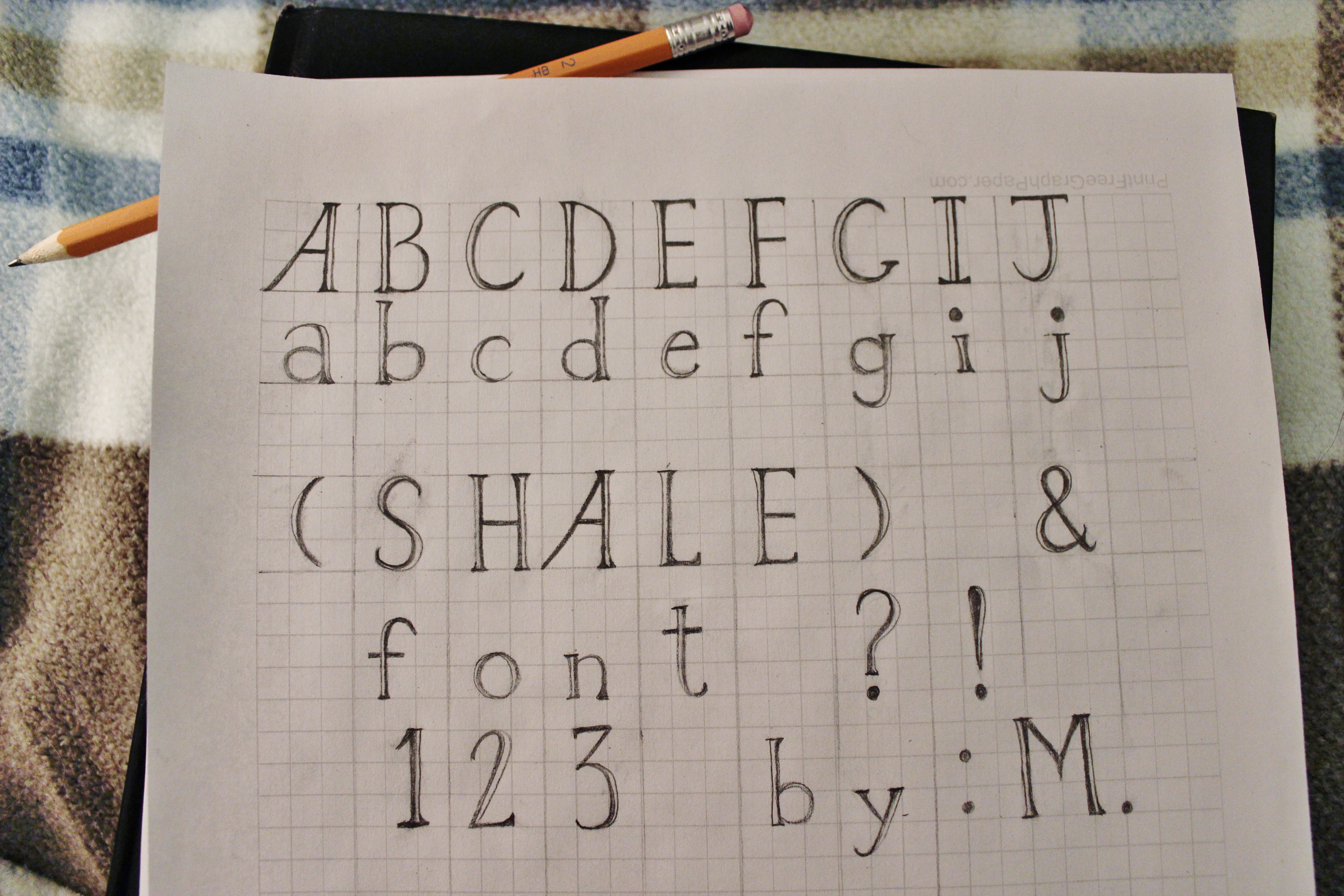
Geology has been on my mind, so I doodled a font inspired by my favorite high-fissility sedimentary rock, shale. It’s rough and cracked (like most rocks!) but attempts to be smooth and layered (like shale, specifically?), yet is ready to split apart from certain angles.
Like several others, I battled unsuccessfully with FontStruct before deciding I needed full control. Drawn in graphite on printed-out graph paper, “Shale” is smudged at this stage, with inconsistent serifs that render it still useless. (I’m no calligrapher, and making all the serifs match is surprisingly difficult by hand! Tracing paper would have improved this project immensely). Once the viewer envisions the ascenders and descenders match in height, the spacing is fixed, etc. and so forth, I imagine a final draft of this font might be used in posters requiring an embossed look with multi-layered letters. It is high-contrast enough to be used for minor announcements, but much too embellished for everyday use.
This all started after my rapid frustration with FontStruct. I got to “d” on that clunky, contrived grid and slammed my laptop shut. How could I create pixels, or basic design units for letter-shapes, in a way that would be manageable for me?
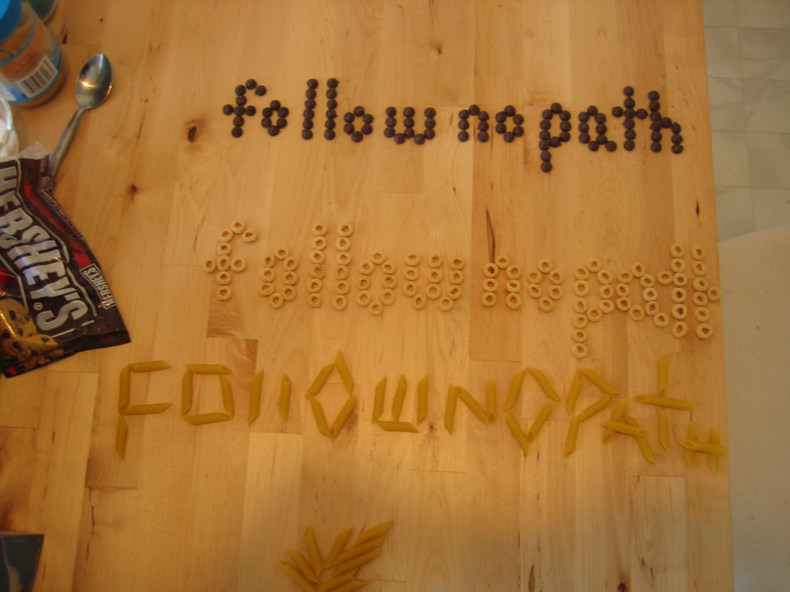
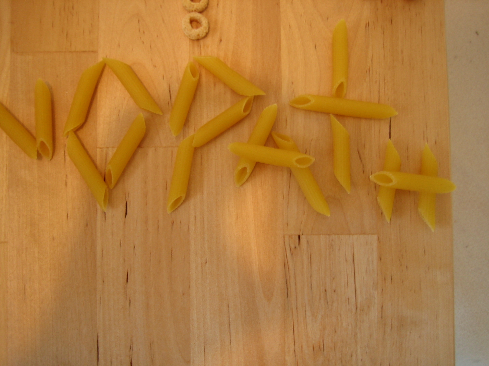
This led me to the kitchen. I thought back to preschool activities when we were encouraged to make designs and words out of foodstuffs, especially pasta.
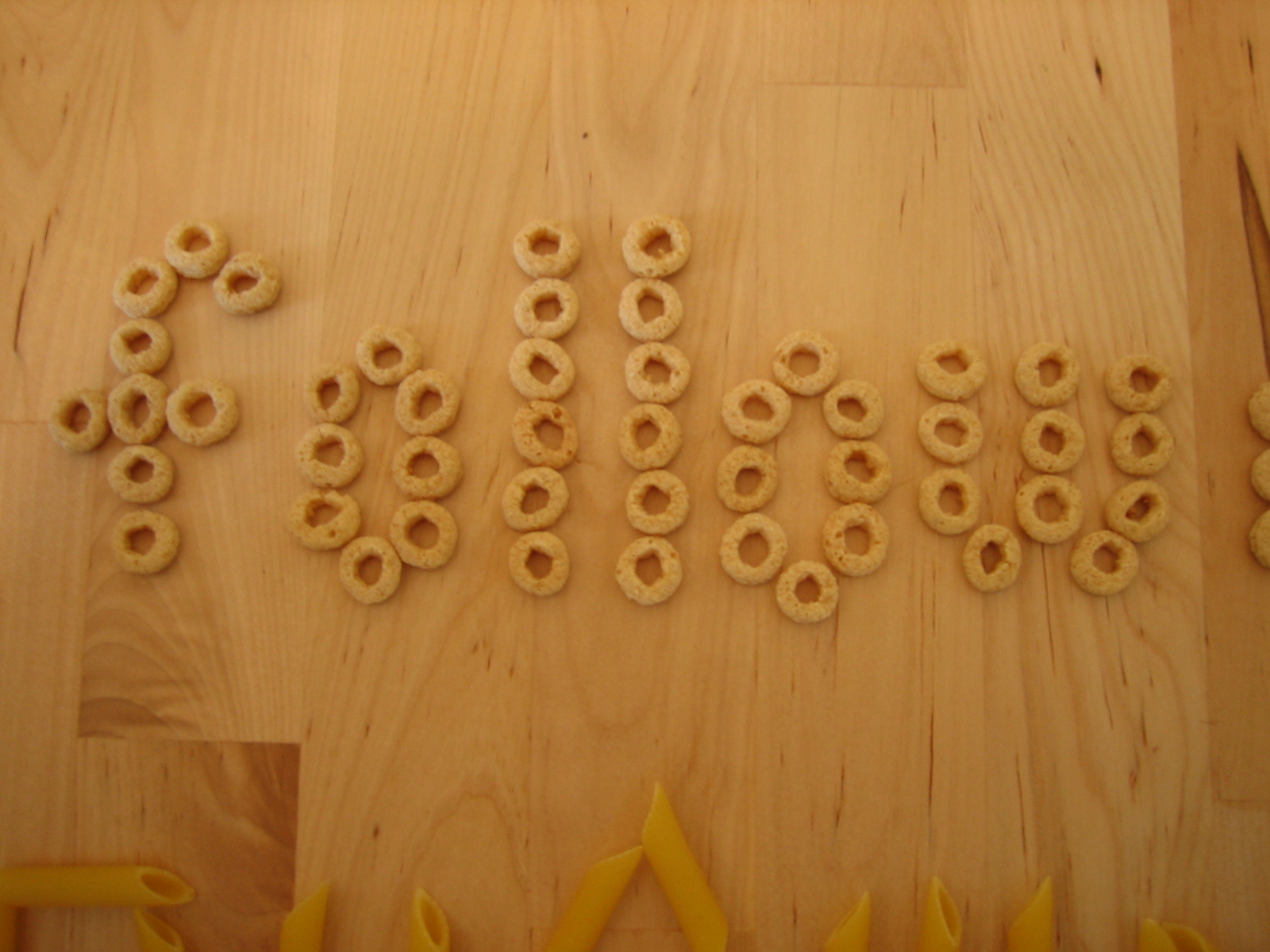
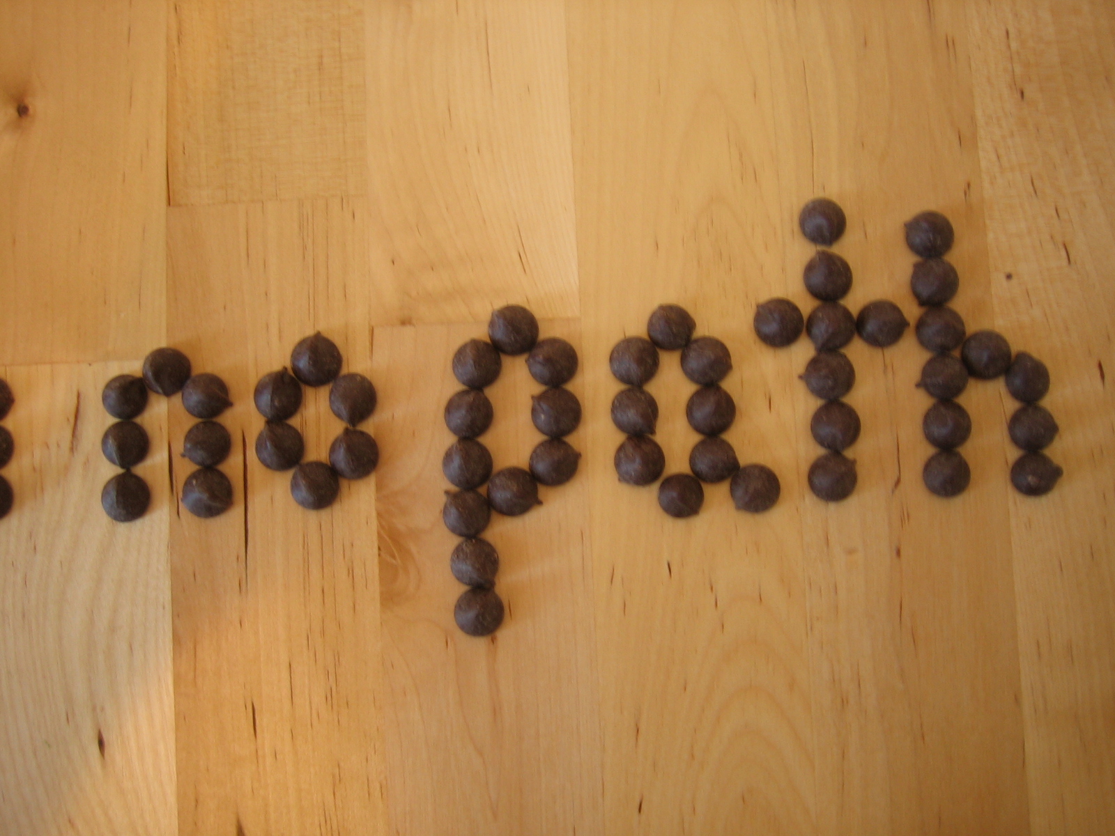
It was easy to make measurable units with chocolate chips and honey nut O’s. I was able to make these letters relate to each other structurally by consistently using the same number of chips and o’s for their height.
(You’ll notice that I misstepped on the o’s “f.” It should have been 6 o’s tall. Didn’t catch this ’til after.)
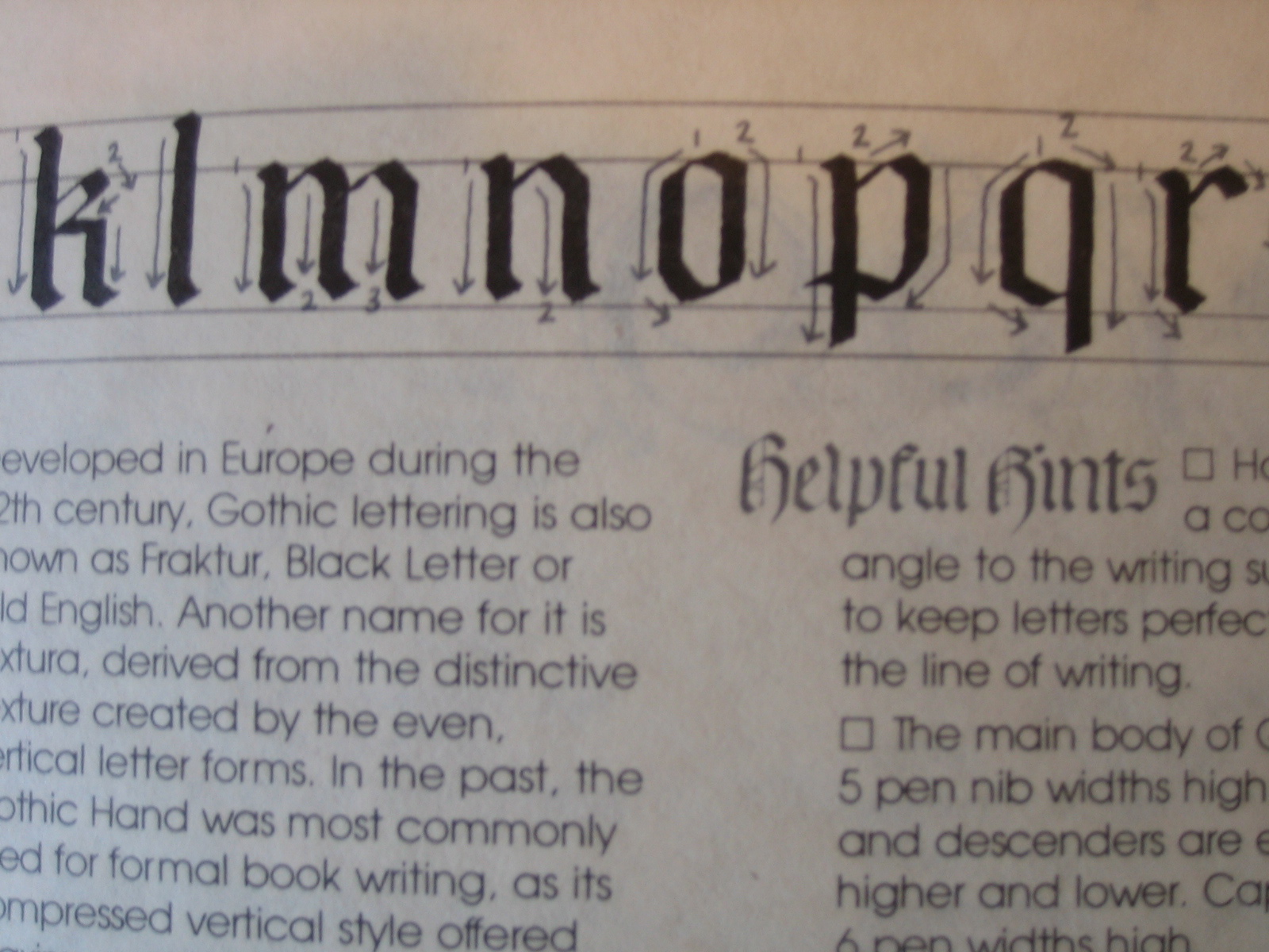
Before starting with any of these materials, I gave some thought more abstractly to how the typeface would be constructed. I found myself struggling to reinvent the alphabet, so to speak. I noticed that the proportions and patterns of the chocolate chip- and honey nut O- fonts that I made rip pretty shamelessly from the Gothic Hand that I learned from a Sheaffer calligraphy book. Look especially at the lowercase.
With a little practice, you realize that the Gothic letters, although they look complicated, respond to just a few basic shapes that repeat over and over. You can really see the basic diamond shape here in the lowercase “o,” “m,” and “n.” The proportions of the letters respond directly to the width of the nib on the pen you’re using. In the Gothic Hand, the basic lowercase letter height is 6 nib-widths high. In Chancery Italic, it’s five. I didn’t go the distance to measure out the chocolate chips, but I could have.
The penne pasta forced me away from these patterns. Obviously, they don’t work as well as pixels because they’re disproportionately long, covering the space of many units. The result, though, was interesting: more jagged, aggressive, rough-hewn letters. They don’t all look like part of the same family.
I also had a jar of capers in the refrigerator, but I figured my point had been made already, and that at any rate they would function pixally like the chips and o’s.
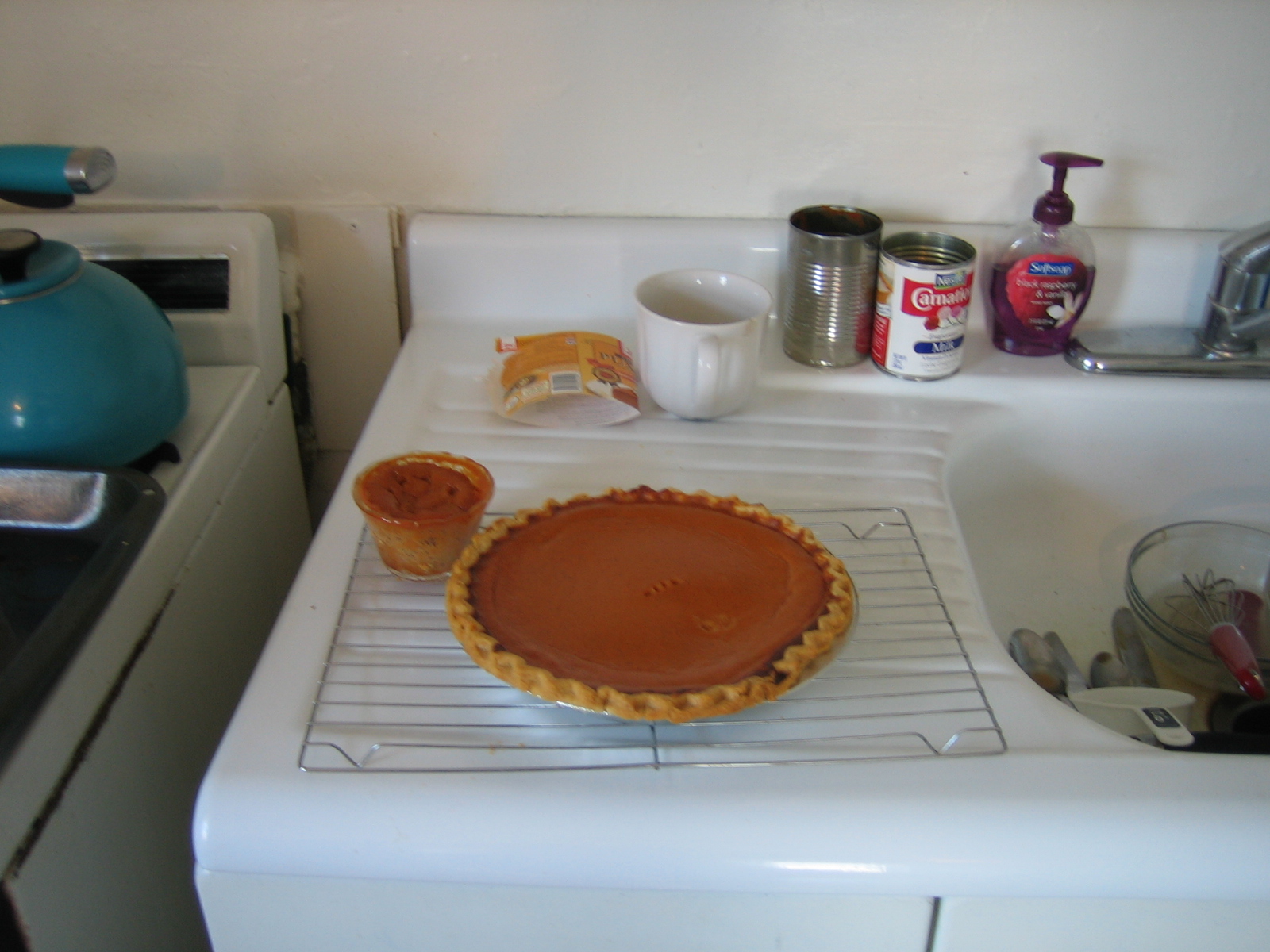
Unfortunately I did not make enough pumpkin pies to test them as a typeface.
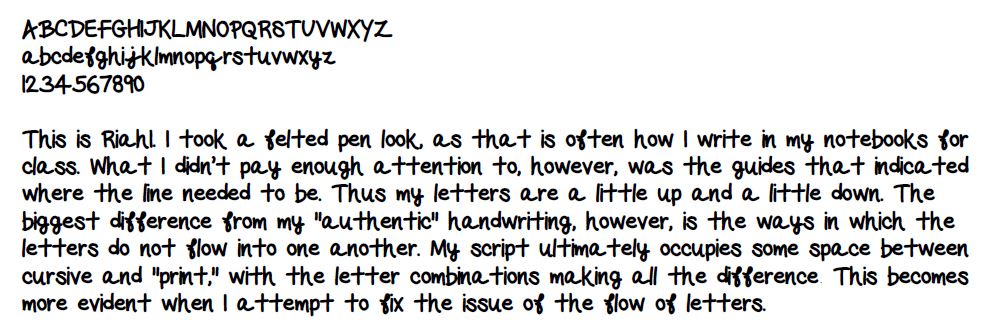
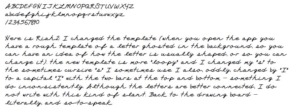
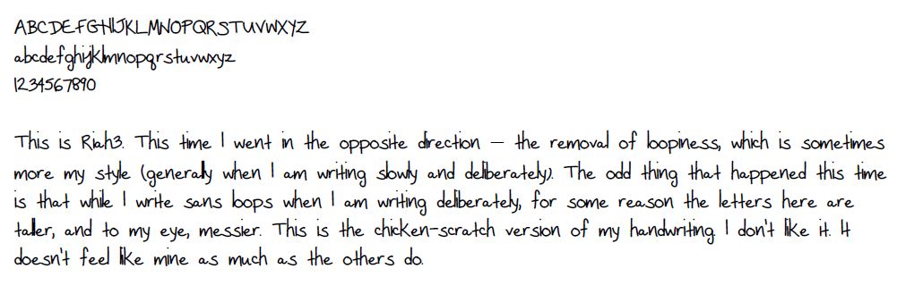
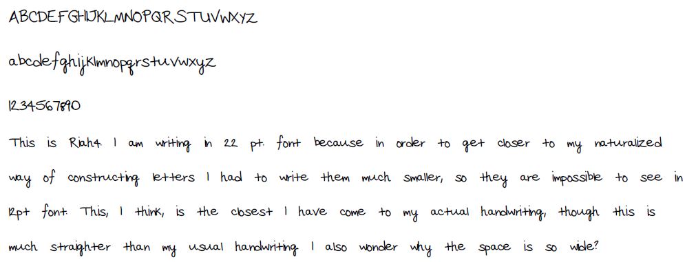
I constructed my fonts with a handwriting-to-font app (InstaFONTmaker) on my Samsung Note 2014 edition 10.1″ tablet (basically it’s the same principle as MyScriptFont.com but without the scanning step). The idea is that my tablet’s stylus, specifically designed and optimized for the Samsung Note tablet and phone series, is meant to allow you to handwrite digitally with great accuracy, and I thought this week’s ‘signment would be a good opportunity to test out its capabilities. What I wasn’t prepared for, however, was what the experiment revealed about how nuanced handwriting truly is – that while many fonts in the digital era mimic handwritten letters, the actual embodied process of handwriting is more dynamic than it might initially seem. Here are a few iterations of the Riah font I came up with, and some brief reflections on what each iteration of the experiment revealed.
These are not groundbreaking realizations. They do, however, offer an image of whatDrucker means when she suggests that “[c]learly the technology of production and the frameworks of conception both contribute to our sense of what a letter is… The limit of what a letter can be is always a product of the exchange between material and ideational possibilities. Sometimes technology leads, sometimes not” (Drucker, 85). When it comes to the nuances of handwritten language, the idea embodied in the written gesture, appears in the interconnectedness of letters – in the loops and sinuous lines that carry the word forward. It is not that these things cannot be replicated by technology, but that it this is, perhaps, not a place where the technology leads. The font, as such, takes the body out.
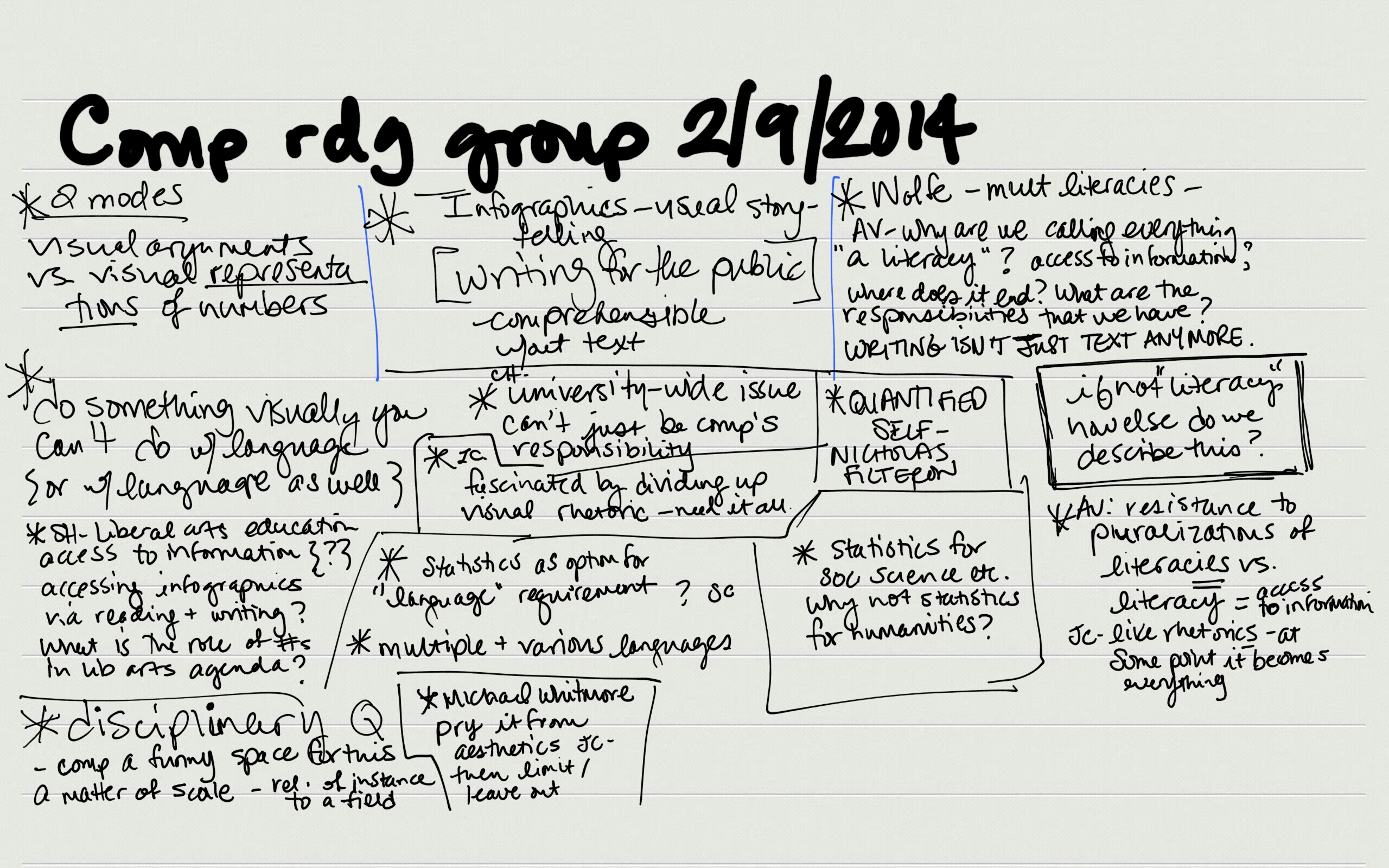
Just as a final point of reference, here is a screenshot of the notes I took during comp reading group on my tablet – while closer to my pen-and-paper handwriting, this isn’t quite it, either… though I hope you see my point.
Posted inUncategorized|Comments Off on Handwriting (n): A particular form, style, or method of writing by hand; the form or style of writing used by a particular person
Today I remembered that this video exists, and I felt like sharing because 1) Björk is awesome, and 2) This video of her explaining how her TV works made me think back to Kirschenbaum’s claims about how we interact with “the mechanisms” of our computers in imaginary or highly (re)-mediated ways.
This video also made me think back to one of our earliest board-based discussions: Does a TV count as a writing material? Certainly, if we are thinking about “the electrical age” as a whole, following McLuhan, the materiality of the TV and the computer seem connected. How do the digital and the electrical relate to one another? How do each relate to “writing(s)?”
Sorry if this seems too off-topic, but Joanna Drucker’s “A to screen” really resonated with Kirschenbaum for me. My font post is coming later.
Posted inUncategorized|Comments Off on Björk talking about her TV
As a kid, I spent a lot of time playing with WordPerfect and Microsoft Word. I’m an only child; my parents both work; I had a lot of afternoons to fill.
Of course, like your standard eight-year-old, I didn’t know the words majuscule or serif or finial.I just knew that there was something about words in Sylfaen that I liked, that Curlz was sort of dizzying and busy, that Comic Sans just looked too goofy to take seriously. I wanted to be a writer even when I was little, so I was spending hours in these programs anyway, but more and more time was spent on tweaking fonts and sizes. Oh, and text effects – anyone remember those borders of marching ants?
As I got older, I got more secretive about what I was writing, if only because embarrassment is a thing you learn and I had finally learned it. So I started using fonts and decorative effects that would obscure my words. Wingdings, for example. There were some fonts that showed up in the dropdown menu but didn’t display correctly on the page, rendering my paragraphs as little villages of identical squares. I’m sure it occurred to me that it’s as easy to change a font back as it is to alter it in the first place, but I trusted that my parents would respect the gesture I was making. (I think they did. Lord, I hope they did. I wrote so many bad Harry Potter rip-offs.)
The reason I’m saying this is that I started thinking about what kind of font I’d design as I was reading Lupton’s book. And, more importantly, I was wondering what I’d use it to say. Then I read Drucker’s mind-blower of an article about symbols, and Foer’s two stories, which have long been favorites of mine, and what I’m trying to say is, I have a font, but it isn’t letters.
Lupton’s description of font ornamentation was really appealing to me, perhaps because it gives the lie to the idea that text is just recorded speech. How do you articulate the modular patterns of an ornament that has been reproduced hundreds of times? Or the sinews of a paragraph division that is almost, but not quite, a flower? They aren’t signifiers in the traditional sense. They signify themselves first. (And, as Drucker reminds us, signifiers and signifieds aren’t inevitably related anyway. The fact that these are the letters I’m typing to you right now is really just the result of thousands of years of chance.)
So I’ve taken a leaf from Foer’s very short book and have designed a typeface for punctuation. In Russian, there are letters that are never articulated; they only tell you how hard or soft the following letter should be. Without them, the words don’t work. That’s what I like about punctuation, too. Weneedittomakesensetoexpressourselvesclearlytocontinuethefutilefightforunambiguity.
Creating the typeface was a pain, by the way. I FontStructed a few glyphs, but they looked sort of minor and tired. How many ways are there to code a period? I used the Paper app on my iPad instead, mostly because I’ve been thinking about Drucker on digital text ever since I finished her piece – specifically, her assertion that “letter design isn’t simply determined by technology,” is instead as much conceptual as it is material. I wanted to give a hat-tip to that.
I made a “notebook” on “paper” with Paper.
It’s a pretty intuitive app. The thing that I like about it is that it so earnestly mimics the experience of using “real” tools; as you can see, your options include pencils, pens, watercolors, and a sort of calligraphic stylus.
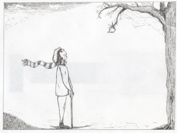
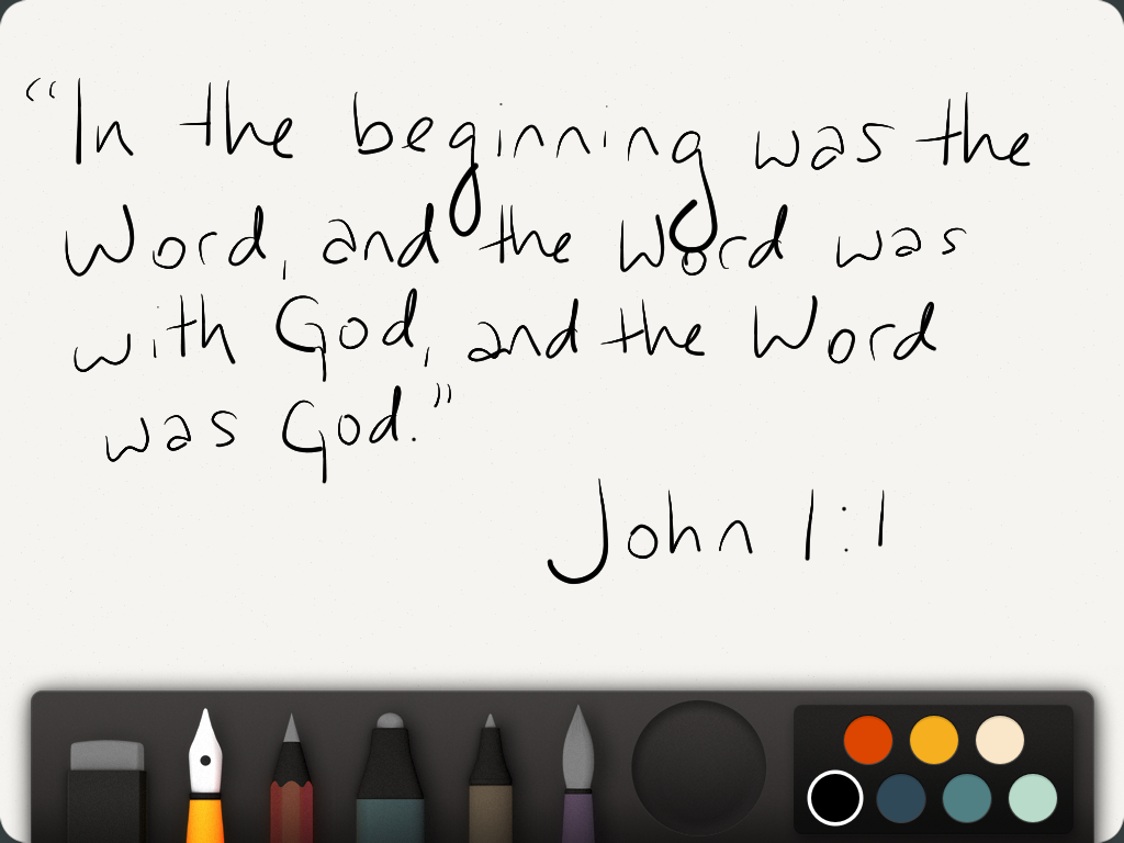
My favorite of Foer’s imagined typefaces is Elena, and I wanted to do something equally impractical and impossible – a typeface that would erase itself as it was typed. That’s one of those things you can really only do in theory and in short stories, but the impulse toward creation/destruction influenced my choice of what to say. Here it is in “my” “handwriting”:
What can I say? I used to teach Sunday School.
(Second choice was “the Moving Finger writes and, having writ, moves on.”)
Anyway, the words don’t matter so much here, at least not as much as what they suggest. The Word is God; God, of course, is the alpha and the omega. So the Word is the alpha and the omega – the word is what it’s made of.
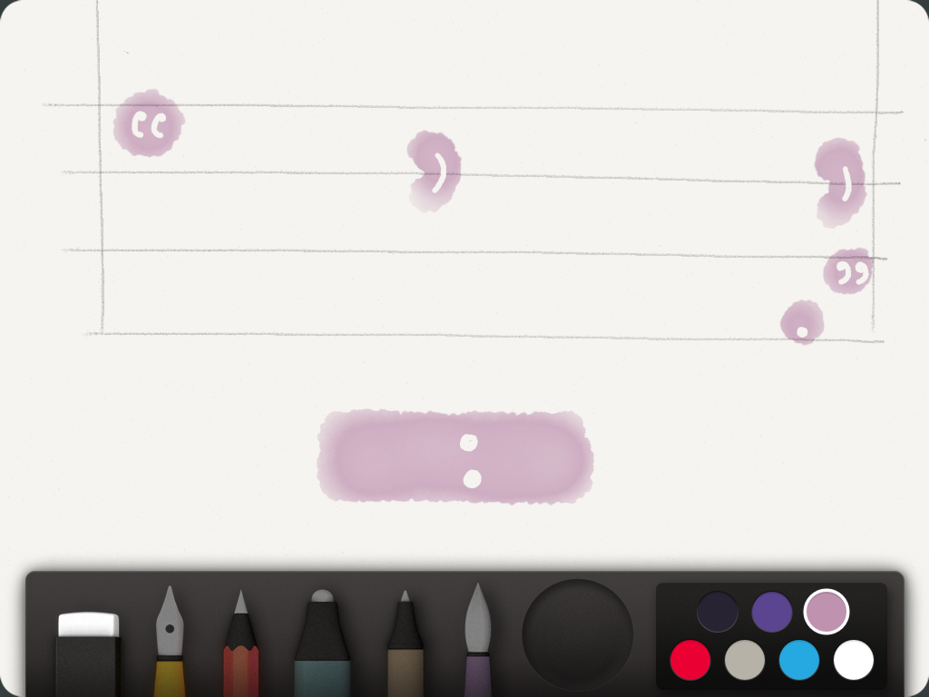
I haven’t yet figured out how to make a font that creates and destroys itself, because I am basically just a schmuck with a tablet, not a genius. I settled for the next best thing, invoking Foer’s punctuation of silences.
” , , .”
It isn’t beautiful, but it’s impossible, and that’s about as good. I sketched out lines where the words weren’t and carved punctuation out of digitized watercolor – there wasn’t any granite available. The salient point here: I drew this, but its form suggests a process that never happened. Only the evidence that I made the gesture of writing is accurate. (I think painting on an iPad voids the warranty, anyway.)
Foer again:
And when the life of the book
dwindled to a single page, as it now does,
when you held your palm against the
inside of the back cover, as if it were her
damp forehead, as if you could will it to
persevere past its end, God would have
been nearly illegible, and I completely
invisible. Had Elena been used, Henry’s
last words would have read:
Just the colon, and then silence. That’s what punctuation is good for.
Posted inUncategorized|Comments Off on Punctuated equilibrium
Let me start by saying I never anticipated how much I would hate the nitty-gritty of font-struction. I notice typography, take pleasure in it, care about it, think carefully about how I use it—but give me a ready-made font any day. (Preferably Didot 10pt, with its thrilling, baseline-dipping numbers.)
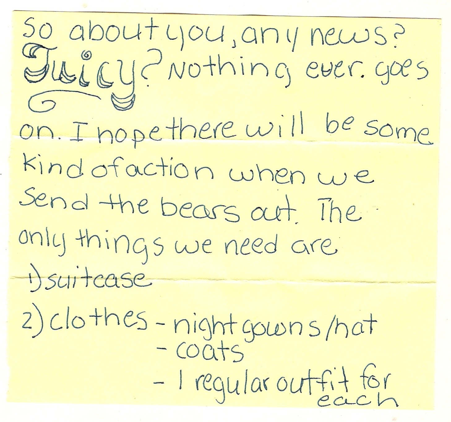
So. A tale about my font-failure. I wanted to make a font based on some handwriting samples from a collection of notes exchanged between my best friend and I when we were twelve. Handwriting instruction has been much on my mind lately—even before this week’s reading. I keep thinking back to the D’Nealian cursive workbooks we had in 2nd or 3rd grade. In my memory, we received the workbooks on the first day of school, but didn’t begin learning cursive until later in the year, so that I spent some period of time looking at the mysterious letters and waiting impatiently to begin practicing. Their scarves and tails sculpted so perfectly to meet each other and make words! I was, clearly, a certain kind of child.
My class was probably one of the last in our school to use the D’Nealian books, to learn cursive at all, and once we learned cursive, it wasn’t enforced, so that my handwriting eventually broke down into the print-cursive hybrid it is today. I don’t know if any of you had similar experiences, but by middle school, I was spending a lot of time trying to figure out what I wanted my handwriting to look like, and my best friend was too, and the notes we exchanged were the stage for those experiments (as well as lots of other more troubling experiments in expression and identity-shaping). The notes below sample this transformation. Most of them are written in my friend’s hand; I always admired her round, playful letters, and the curls of her cursive. My writing was more narrow and proper, rule-bound—which, come to think of it, is pretty much how my classmates thought of me, so maybe that’s why I didn’t care for my hand.
I wanted to make a font that worked with this hybridity. I looked at the handwriting template first, but I felt like it was too constricting, like it would be impossible to fit my friend’s letters in there. So I went over to FontStruct—and learned very quickly that the geometrical piecing together of letters on a grid is not for curve-stubborn perfectionists like me. I mean, really: Not. For. Me.
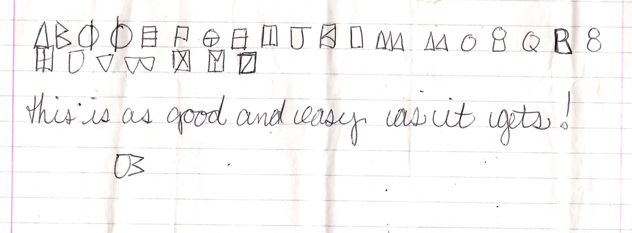
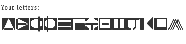
But I (somewhat) persevered. I settled on making a digital version of the code in the above note (we were always coming up with new codes that made writing things like “Sit by me at lunch?” more work than they were worth). I’ve only gotten to the letter M, and I feel like many hours and days later I am only just now acquiring the grid-puzzle-friendly vision to actually do this well. If I ever finish this font to satisfaction, I would call it Maritime, for the boating flags that it reminds me of, which people sometimes string along their porches in the Thousand Islands.
I don’t know if kids write in codes to their best friends anymore: how many middle-schoolers have cell phones now, and don’t those offer a kind of privacy that makes code unnecessary? But maybe my font would do well on some sort of maritime poster. My cousin’s having a nautical-themed wedding in May—maybe I’ll try to pitch it to her.