For homework, I asked my students to submit three prompts derived from poems in Natalie Diaz’s When My Brother Was an Aztec. This is one of them.
6. If Eve Side-Stealer & Mary Busted Chest Ruled the World
Write a poem alluding to well-known stories, sayings, metaphors, and/or something of the like, but suggesting a change in the story, as to create a new imaginative world in order to convey one idea. Use at least 4 stanzas and at least 1 story, saying, metaphor, etc. per stanza.
E.g. In “If Eve Side-Stealer & Mary Busted Chest Ruled the World,” Diaz suggests a slight change in biblical stories and extends the stories with metaphors to speak to an issue of racial perception.
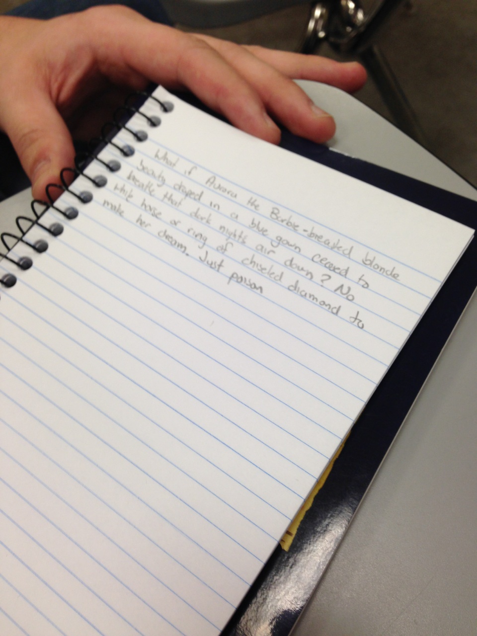
My student wrote a poem about the Disney princesses. She asks the question, “What if the princesses had ignored the men? Would they still be beautiful? Is beauty something one can possess only in the presence of a man?”
She drops some dramatic images, some nails and coffin, some apple, some hair ripped out, some sarcastic descriptors (“barbie-breasted blonde”), and she ends with the line: “And in the absence of heroic Princes, what became of beauty?”
This poem, as all poems, is a record of a moment in her life, this second semester of her Freshman year, her writing out of her childhood, of the early stages of her feminist inquiry, perhaps, of her relationship to men, to her consumption of media, to her fear of death, even. These are real concerns, real important concerns, and this is a record of all of this.
And yet, it is mostly a record of my own life, because it was not her decision to print the poem; it was my own.
1. The poem did not make optimal use of available line breaking strategies.
2. The poem was complicated enough to invite a multiplicity of meaning, given the proper use of line breaks.
3. The project was similar to many other students’, so it had value as a class-wide pedagogical tool.

This is the decision-making process. But in order to understand that, you must understand this:
I’ve been writing prose poems for a very long time. For a while it was the only thing I could write. Everything was in prose. And I began to fantasize about a poem that wasn’t simply prose — I wanted a poem that was one line. Without page breaks, without wrapping down to the next line, just one long scroll with a single line. This could be the aim of a particular prose poem — many prose poems thrive in the sort of text block thing that happens when you write prose, but others seem to want to emphasize their unbrokenness. Their wholeness. Their fluidity. Mine did.
What is a poem without line breaks? It is almost not a poem. This is what I wanted to explore. But then I started breaking my lines. And so.
The printing of this poem embodies that mindset. It is the possibility of materiality that I’d been considering even before designing the assignment. Before even knowing I’d be teaching poetry this semester.
And in order to understand the urge toward the prose poem, you have to understand this:
My poems had short sentences. They moved like this. They were harsh. They were violent. They wanted nothing. They wanted everything. They were hopeless. They were lost. They wanted to break. They were breaking. I was seeing images of death. I was seeing entrapment. My tongue was caught. And my language showed this.
The form of the prose poem speaks to me. Prose poems keep plodding on and on. They never stop. There is no white space. No breathing room. No breathing. And when breath and rhythm are controlled solely by syntax, it is these short, violent, subject-verb sentences that rise to the occasion.
My student’s poem was not a prose poem. But it had that feeling. Not because her sentences were the same sort of sentence I’d been writing. But that violence, that lack of breath, that overwhelming force of language, that anger, that confusion. That’s what I was drawn to, and that’s the feeling I thought she was undermining with her haphazard line breaks that brought an amount of air/levity to the piece.
In order to understand my love of the prose poem, you have to understand when I started writing them. I wrote about my mother. I wrote about my father. And I wrote about internment camp. There are no line breaks in internment camp. There are fences, it is crowded, there is no room to breath, and when you do, the dust gets in your lungs. It is cold, and then it is hot. It is hot and then it is cold. Everything you do, someone knows. There is no privacy. There are guards with guns watching your every move. There are your annoying neighbors who complain every time you roll over in your straw mattress. The floorboards creak. Someone knows you’re getting up for breakfast. And everyone knows what you ate that morning. Because they ate the same thing, too.
Perhaps it is too much to say that internment caused my love of the prose poem. Perhaps it is too much to say that my parents’ divorce caused the prose poem. Perhaps it is too much to say that moving to Pittsburgh caused the prose poem. Perhaps there is too much to be said. There. Perhaps that’s the cause of the prose poem: when you are completely overwhelmed by language, by the possibilities of all that could be said, and you crumple into a ball and try your hardest to say something, but nothing comes out, because there is nothing you can say to convey the horror of war/displacement/exile.
(There is no metaphor for exile.)
I worry that sometimes people believe is better to be dead and free of the oppressor, as my student writes of Snow White. This is the complicated nature of her poem: within the world of the Disney movie, the only way to escape oppression is to be dead, ugly, or miserable. And often it seems like these are the only options available to us as well. It makes sense to me that one might become a suicide bomber. And that’s a scary statement to make. But if it is your family, your loved ones you are fighting for, and if you believe, in your rational mind, that this will help, somehow, to make the world better, you’ll do it. What if Snow White eats the apple and dies? What if she’d rather be dead?
This is a record of how far we’ve come since Snow White. That our college freshmen can critique Disney movies, can, without prompting, investigate a feminist line of inquiry on their own, and actually get somewhere with it.
Of course this all comes back to me, and my decision to print. It comes back to me, and the laser printer that my mother gave me, because, she says, all writers need a laser printer. It comes back to my mother, and her support of me in pursuing this creative endeavor. It comes back to my mother, who showered my sister and me with all kinds of creative outlets when we were small, paint and crayons and glue and feathers and fuzzy ball things, her enrolling me in music lessons, the stories I wrote when I was small, the plays my grandmother helped me type up on our Apple IIe computer, the books upon books that my grandmother bought me, my grandmother making “S” sounds when we passed stop signs, the lyrics I began to write in 7th grade, AOL Instant Messenger chats I had with my friends, where we challenged each other to not look at the keyboard when we typed. The decision to transfer to UC Riverside and study creative writing. The poets who made me decide to write poetry instead of fiction. The MFAers here at Pitt that decided to ask both me and Michelle to join the program.
And I’m sure my student has the same sort of historical record that she brings to the document. And there is something about our relationship, my ability to freely be myself in the classroom, something I’ve been able to do only now, in my fourth semester of teaching, my ability to share myself, and to allow students to share themselves as well, it’s about bringing to them the concept of duende, and having them understand it better than many grad students, it’s about creating an environment in which students feel safe enough to submit poems that are experimenting, are trying, are important. And this is something that I am proud of having accomplished, in some sense. And I’m grateful to my students for giving back to me what I believe I am trying to give them.
Poetry is, in the end, about human connection. Line breaks are there to enhance this connection.
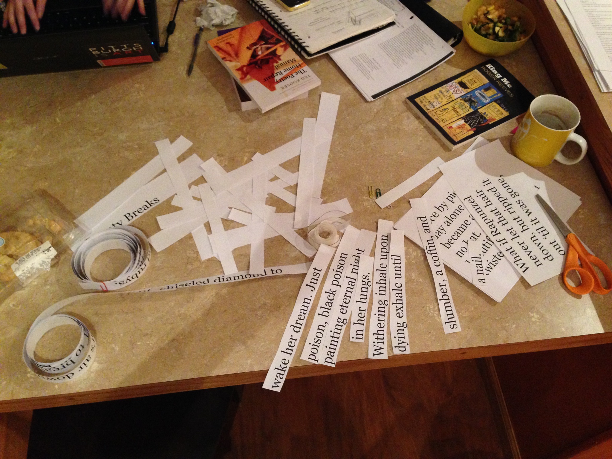
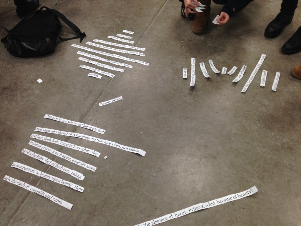
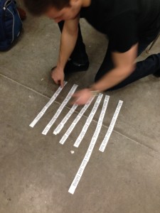
This is how we practiced those line breaks: I broke the students into three groups.
Each group was tasked with a different assignment.
Group 1: create surprising lines
Group 2: create additional meanings within the lines
Group 3: create aesthetically pleasing lines

They were to tear/cut the one line into separate lines. This is what they did. The assignment worked well. This is not the point. Or perhaps it is.
It is, because this physicality of working with language is the point. Because the act of tearing, the act of arranging, the act of seeing words in 48 point Georgia looking at you from the ground of a classroom in the Cathedral of Learning is exciting, gets me excited about poetry. Because we debated leaving the poem in its broken form in the middle of the classroom for the sorority meeting that follows. Because we ultimately decided it would simply be too messy, despite our guerrilla poetry aspirations. Because my student wants people to read her work. Because she’s proud of it, and seeing it in material form gave it more meaning, more substance. Because my selecting of her poem gave her a certain level of gratification. Because she knows that it is important to work to me. Because all my students’ poetry is important work to me.
It is not, because this does not let you understand what my family went through to allow me to be here, to put words on the ground, to teach a class of undergrads how to write poetry. It is not, because you can’t understand my love of the prose poem, my frustration with language, my frustration with my parents, my frustration with myself. You can’t understand how blessed I am to have been given the things I’ve been given, my grandmother’s love, her insistence upon reading, the library she’s gifted me, the hours she spent with me in her lap, pointing at words, asking me to read along. You can’t understand my mother, her love, how she now listens to audiobooks because she wants to be closer to me and my writing, my mother, who buys books on poetry and tries to understand. My paternal grandmother, who listens to NPR and watching PBS, recording all of the poems she hears, all of the interviews with all of the poets, the grandmother who taught me how to read, who has since gone blind, this wonderful audiobook technology that allows her, as well, to continue to read. You cannot understand what it means to love a group of people so much that you could die for them, you could kill for them — when the world feels unjust and unfair and there seems to be no way out — you cannot understand why I write the prose poem, what the prose poem means, how much I need the prose poem, how much I need poetry.
poetry means refusing
the choice to kill or die
— Adrienne Rich
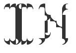


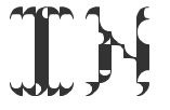
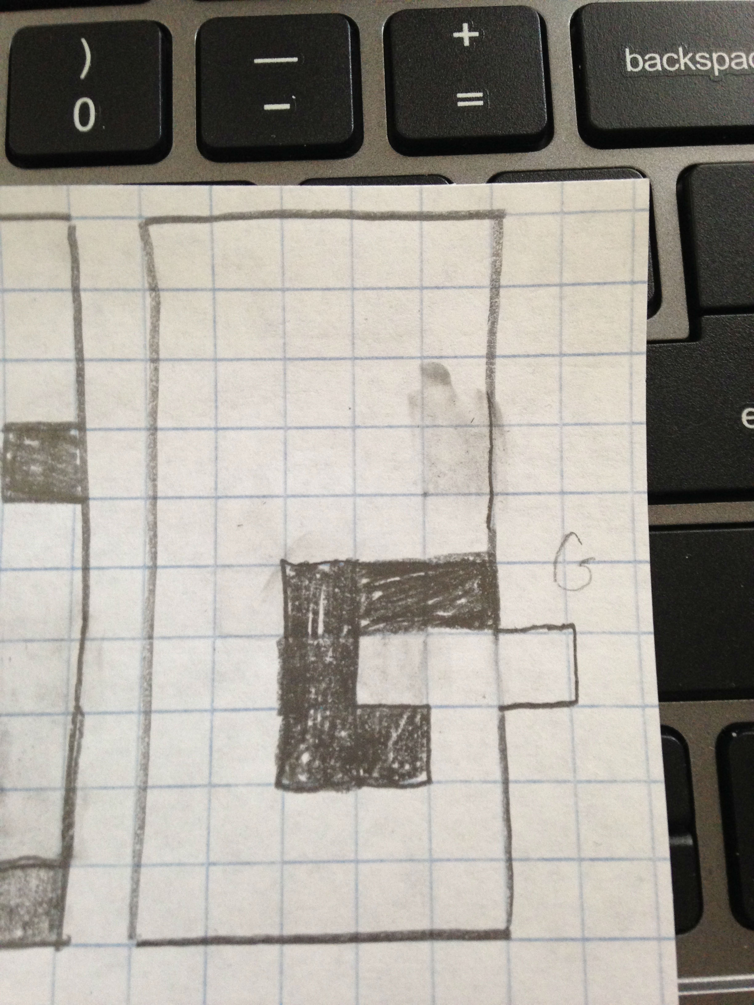
 I worked on tweaking the “N” to using the thicker straight lines, but felt it just looked better with the thinner lines. I think Lupton would hate that I didn’t keep line widths consistent, so here is a comparison