As a kid, I spent a lot of time playing with WordPerfect and Microsoft Word. I’m an only child; my parents both work; I had a lot of afternoons to fill.
Of course, like your standard eight-year-old, I didn’t know the words majuscule or serif or finial. I just knew that there was something about words in Sylfaen that I liked, that Curlz was sort of dizzying and busy, that Comic Sans just looked too goofy to take seriously. I wanted to be a writer even when I was little, so I was spending hours in these programs anyway, but more and more time was spent on tweaking fonts and sizes. Oh, and text effects – anyone remember those borders of marching ants?
As I got older, I got more secretive about what I was writing, if only because embarrassment is a thing you learn and I had finally learned it. So I started using fonts and decorative effects that would obscure my words. Wingdings, for example. There were some fonts that showed up in the dropdown menu but didn’t display correctly on the page, rendering my paragraphs as little villages of identical squares. I’m sure it occurred to me that it’s as easy to change a font back as it is to alter it in the first place, but I trusted that my parents would respect the gesture I was making. (I think they did. Lord, I hope they did. I wrote so many bad Harry Potter rip-offs.)
The reason I’m saying this is that I started thinking about what kind of font I’d design as I was reading Lupton’s book. And, more importantly, I was wondering what I’d use it to say. Then I read Drucker’s mind-blower of an article about symbols, and Foer’s two stories, which have long been favorites of mine, and what I’m trying to say is, I have a font, but it isn’t letters.
Lupton’s description of font ornamentation was really appealing to me, perhaps because it gives the lie to the idea that text is just recorded speech. How do you articulate the modular patterns of an ornament that has been reproduced hundreds of times? Or the sinews of a paragraph division that is almost, but not quite, a flower? They aren’t signifiers in the traditional sense. They signify themselves first. (And, as Drucker reminds us, signifiers and signifieds aren’t inevitably related anyway. The fact that these are the letters I’m typing to you right now is really just the result of thousands of years of chance.)
So I’ve taken a leaf from Foer’s very short book and have designed a typeface for punctuation. In Russian, there are letters that are never articulated; they only tell you how hard or soft the following letter should be. Without them, the words don’t work. That’s what I like about punctuation, too. Weneedittomakesensetoexpressourselvesclearlytocontinuethefutilefightforunambiguity.
Creating the typeface was a pain, by the way. I FontStructed a few glyphs, but they looked sort of minor and tired. How many ways are there to code a period? I used the Paper app on my iPad instead, mostly because I’ve been thinking about Drucker on digital text ever since I finished her piece – specifically, her assertion that “letter design isn’t simply determined by technology,” is instead as much conceptual as it is material. I wanted to give a hat-tip to that.
It’s a pretty intuitive app. The thing that I like about it is that it so earnestly mimics the experience of using “real” tools; as you can see, your options include pencils, pens, watercolors, and a sort of calligraphic stylus.
My favorite of Foer’s imagined typefaces is Elena, and I wanted to do something equally impractical and impossible – a typeface that would erase itself as it was typed. That’s one of those things you can really only do in theory and in short stories, but the impulse toward creation/destruction influenced my choice of what to say. Here it is in “my” “handwriting”:
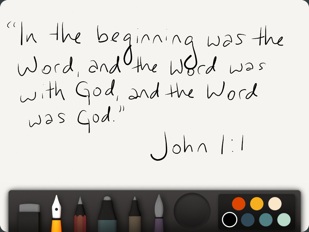
(Second choice was “the Moving Finger writes and, having writ, moves on.”)
Anyway, the words don’t matter so much here, at least not as much as what they suggest. The Word is God; God, of course, is the alpha and the omega. So the Word is the alpha and the omega – the word is what it’s made of.
I haven’t yet figured out how to make a font that creates and destroys itself, because I am basically just a schmuck with a tablet, not a genius. I settled for the next best thing, invoking Foer’s punctuation of silences.
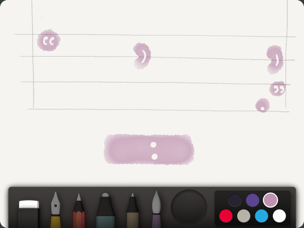
It isn’t beautiful, but it’s impossible, and that’s about as good. I sketched out lines where the words weren’t and carved punctuation out of digitized watercolor – there wasn’t any granite available. The salient point here: I drew this, but its form suggests a process that never happened. Only the evidence that I made the gesture of writing is accurate. (I think painting on an iPad voids the warranty, anyway.)
Foer again:
And when the life of the book
dwindled to a single page, as it now does,
when you held your palm against the
inside of the back cover, as if it were her
damp forehead, as if you could will it to
persevere past its end, God would have
been nearly illegible, and I completely
invisible. Had Elena been used, Henry’s
last words would have read:
Just the colon, and then silence. That’s what punctuation is good for.
