So….
At this point, I’ve spend about 4-6 hours on this. But I don’t have a finished product. My original idea for this signment was to create a variation on a “Dr. Seuss” font. When I was in high school, we had these old-skool overhead projectors in math class. (I swear I’m not a math nerd, I don’t know why I keep bringing up math. I’m not myself.) Anyway, we’d write on these transparent cellulose-based pieces of paper that had been printed with math problems with dry erase markers in front of the class. You know, everyone do math LIVE, don’t mess up. And one time, in algebra, I was working out a problem. In algebra, math sometimes involves letters, although the signification is quite different and not actually related to the English language. Probably the Greeks, it all goes back to the Greeks. (“Or does it???”—Joanna Drucker.) The point is this: a kid in the class yelled out that my handwriting looked like Dr. Seuss. At the time, I wasn’t sure what that meant, except perhaps irregular or quirky or weird. Yet, the statement stuck with me. If I was called upon to describe my handwriting today, I’d probably say “like Dr. Seuss” automatically, yet with a vague and detached air because I don’t actually know what that means.
After perusing Ellen Lupton’s guide and re-viewing Helvetica, I decided to really find out what font(s) Dr. Seuss used. I did some hard-hitting research on Google, and from the first few entries, it seems that Dr. Seuss books primarily contain several different variations of Garamond. I also found someone claiming that there was a trademarked font called “Dr Soos,” but I’m dubious, that was on a yahoo thread or something. I decided to look at pictures of Seussian book covers.
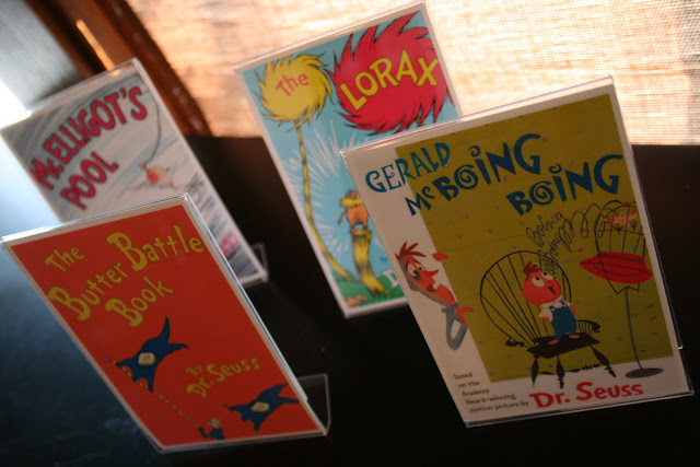
The “By Dr. Seuss” is pretty consistent in appearance, but the other type varies dramatically from book to book, and from the “By Dr. Seuss” font itself. Many of these fonts look like they MUST be illustrated to me, rather than a regular font. (Note the curly-cues etc.) Also, worthy of note: Garamond is a serif font, but these books are pretty willy nilly and inconsistent in their use of serifs, and tend to lean more heavily toward the sans serif than the serif. However, the capital “D” and “B” in “By Dr. Seuss” always maintain a humble yet blocky serif, in flagrant disregard of what the rest of the letters are doing, which usually does not involve serifs. However, like with Garamond, with Seuss, we see the “lilting” counters by which Lupton characterizes “humanist” typefaces.
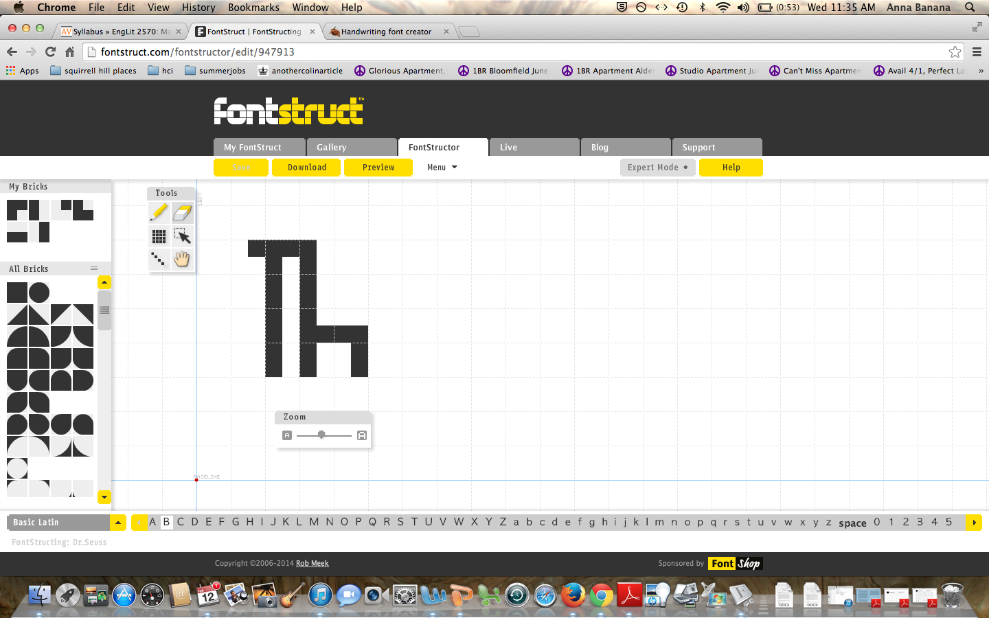
I wanted to design my own version of Dr. Seuss, one completely sans serif and without lilting counters, BUT with a certain lilting character to the lines, an almost-italics-but-not-really (in bad taste.) That’s how I write, my upright, vertical lines tend to lilt to the right, merging with the next letter, and refusing to remain upright. Something about this seems Seussian. However, I completely failed at finishing the task in either fonstruct or myscriptfont in a reasonable amount of time. With fonstruct, I couldn’t judge how the letters looked TOGETHER, side by side, if I followed it’s letter by letter format. When I tried to just write a sentence within a one-letter space it started glitching out on me. Also, the bricks weren’t allowing me to design a lilting font anyway.
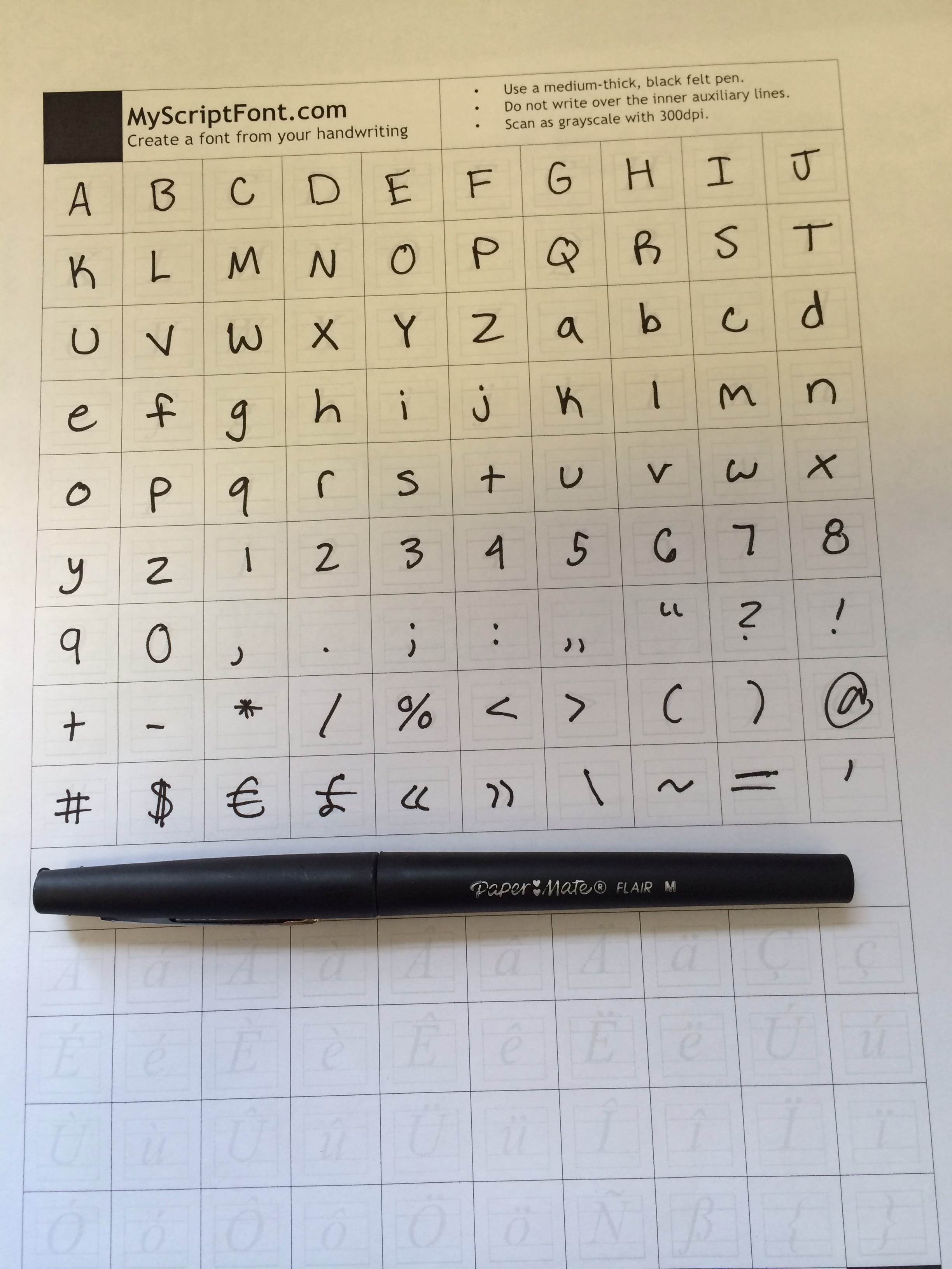
This morning I switched over to myfontscript. I’m not really sure what went wrong here. As you see, both of my font attempts ended up being super modernist and abstract, and not dissimilar to furniture in appearance. I’ve included my template to give you an idea of just how wrong things went. I haven’t had time to investigate why though. I’m hungry. Also worthy of note: things went wrong on the template too. I couldn’t really lilt as desired because they have these guiding letters that lilt in a Kindergarten-teacher, not a Seussian way. I kept spazzing out and following those lines instead of doing my own thing.
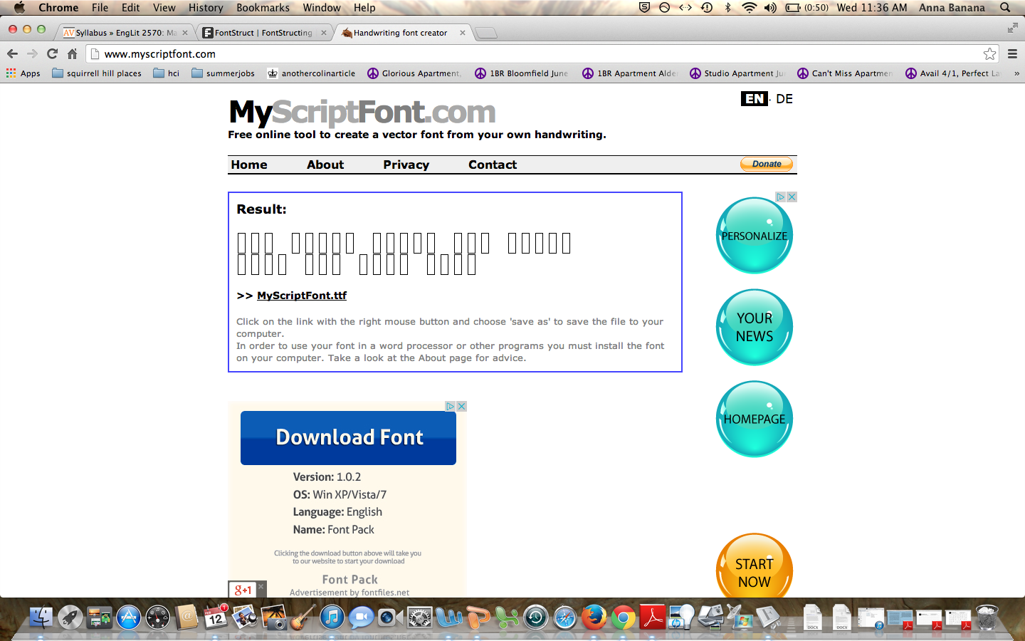
Not what I was going for at all. Although, it is interesting to think about how much failure resembles IKEA.
